Collections
A collection manages an ordered set of content and presents it in a customizable and highly visual layout.
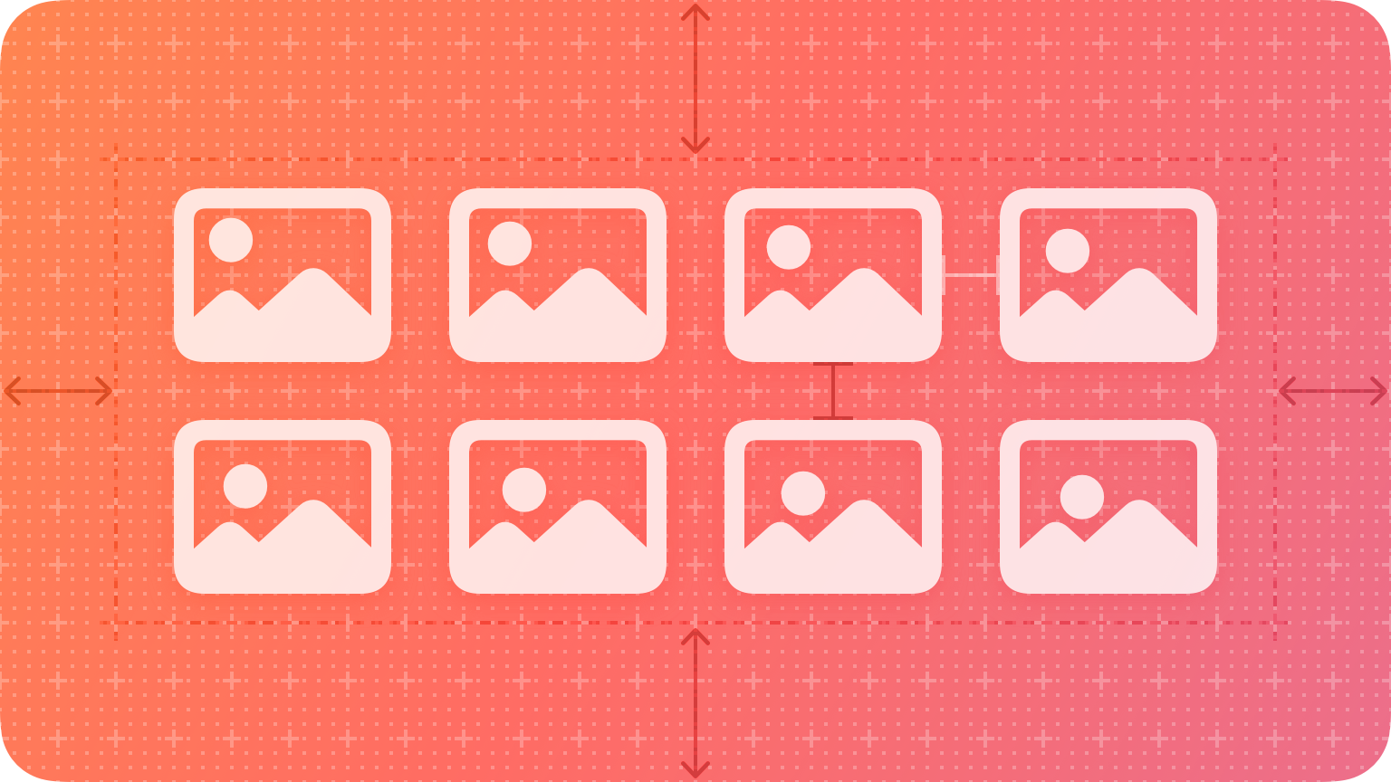
Generally speaking, collections are ideal for showing image-based content.
Best practices
Use the standard row or grid layout whenever possible. Collections display content by default in a horizontal row or a grid, which are simple, effective appearances that people expect. Avoid creating a custom layout that might confuse people or draw undue attention to itself.
Consider using a table instead of a collection for text. It’s generally simpler and more efficient to view and digest textual information when it’s displayed in a scrollable list.
Make it easy to choose an item. If it’s too difficult to get to an item in your collection, people will get frustrated and lose interest before reaching the content they want. Use adequate padding around images to keep focus clear and prevent content from overlapping.
Add custom interactions when necessary. By default, people can tap to select, touch and hold to edit, and swipe to scroll. If your app requires it, you can add more gestures for performing custom actions.
Consider using animations to provide feedback when people insert, delete, or reorder items. Collections support standard animations for these actions, and you can also use custom animations.
Platform considerations
No additional considerations for macOS or tvOS. Not supported in watchOS.
iOS, iPadOS
Use caution when making dynamic layout changes. The layout of a collection can change dynamically. Be sure any changes make sense and are easy to track. If possible, try to avoid changing the layout while people are viewing and interacting with it, unless it’s in response to an explicit action.


