Action sheets
An action sheet is a modal view that presents choices related to an action people initiate.

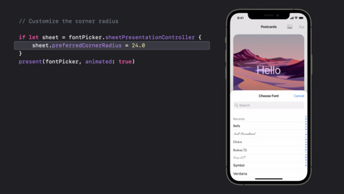
DEVELOPER NOTE When you use SwiftUI, you can enable action sheet functionality in all platforms by specifying a presentation modifier for a confirmation dialog. If you use UIKit, you use the actionSheet style of UIAlertController to display an action sheet in iOS, iPadOS, and tvOS.
Best practices
Use an action sheet — not an alert — to offer choices related to an intentional action. For example, when people cancel the Mail message they’re editing, an action sheet provides three choices: delete the edits (or the entire draft), save the draft, or return to editing. Although an alert can also help people confirm or cancel an action that has destructive consequences, it doesn’t provide additional choices related to the action. More importantly, an alert is usually unexpected, generally telling people about a problem or a change in the current situation that might require them to act. For guidance, see Alerts.
Use action sheets sparingly. Action sheets give people important information and choices, but they interrupt the current task to do so. To encourage people to pay attention to action sheets, avoid using them more than necessary.
Aim to keep titles short enough to display on a single line. A long title is difficult to read quickly and might get truncated or require people to scroll.
Provide a message only if necessary. In general, the title — combined with the context of the current action — provides enough information to help people understand their choices.
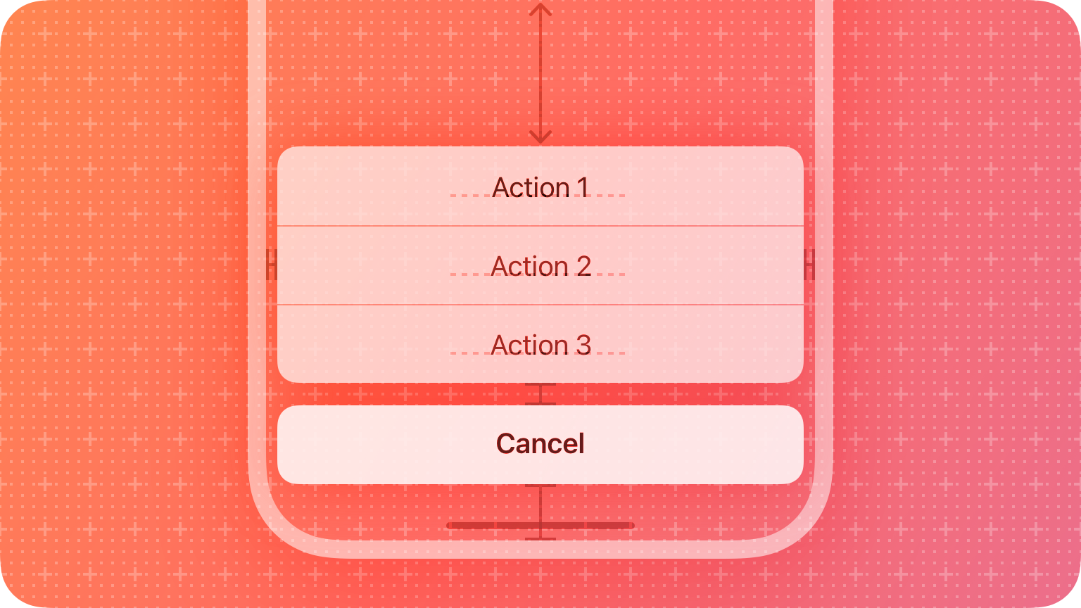
If necessary, provide a Cancel button that lets people reject an action that might destroy data. Place the Cancel button at the bottom of the action sheet (or in the upper-left corner of the sheet in watchOS). A SwiftUI confirmation dialog includes a Cancel button by default.
Make destructive choices visually prominent. Use the destructive style for buttons that perform destructive actions, and place these buttons at the top of the action sheet where they tend to be most noticeable. For developer guidance, see destructive (SwiftUI) or UIAlertAction.Style.destructive (UIKit)
Platform considerations
No additional considerations for macOS or tvOS.
iOS, iPadOS
Use an action sheet — not a menu — to provide choices related to an action. People are accustomed to having an action sheet appear when they perform an action that might require clarifying choices. In contrast, people expect a menu to appear when they choose to reveal it.
Avoid letting an action sheet scroll. The more buttons an action sheet has, the more time and effort it takes for people to make a choice. Also, scrolling an action sheet can be hard to do without inadvertently tapping a button.
watchOS
The system-defined style for action sheets includes a title, an optional message, a Cancel button, and one or more additional buttons. The appearance of this interface is different depending on the device.
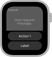
Series 4 and later
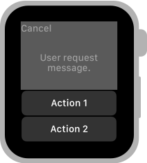
Series 3 and earlier
Each button has an associated style that conveys information about the button’s effect. There are three system-defined button styles:
| Style | Meaning |
|---|---|
| Default | The button has no special meaning. |
| Destructive | The button destroys user data or performs a destructive action in the app. |
| Cancel | The button dismisses the view without taking any action. |
Avoid displaying more than four buttons in an action sheet, including the Cancel button. When there are fewer buttons onscreen, it’s easier for people to view all their options at once. Because the Cancel button is required, aim to provide no more than three additional choices.
Resources
Related
Developer documentation
- confirmationDialog(_:isPresented:titleVisibility:actions:) — SwiftUI
- UIAlertController.Style.actionSheet — UIKit