Popovers
A popover is a transient view that appears above other content onscreen when people click or tap a control or interactive area.
Best practices
Use a popover to expose a small amount of information or functionality. Because a popover disappears after people interact with it, limit the amount of functionality in the popover to a few related tasks. For example, a calendar event popover makes it easy for people to change the date or time of an event, or to move it to another calendar. The popover disappears after the change, letting people continue reviewing the events on their calendar.
Consider using popovers when you want more room for content. Views like sidebars and panels take up a lot of space. If you need content only temporarily, displaying it in a popover can help streamline your interface.
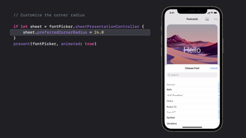
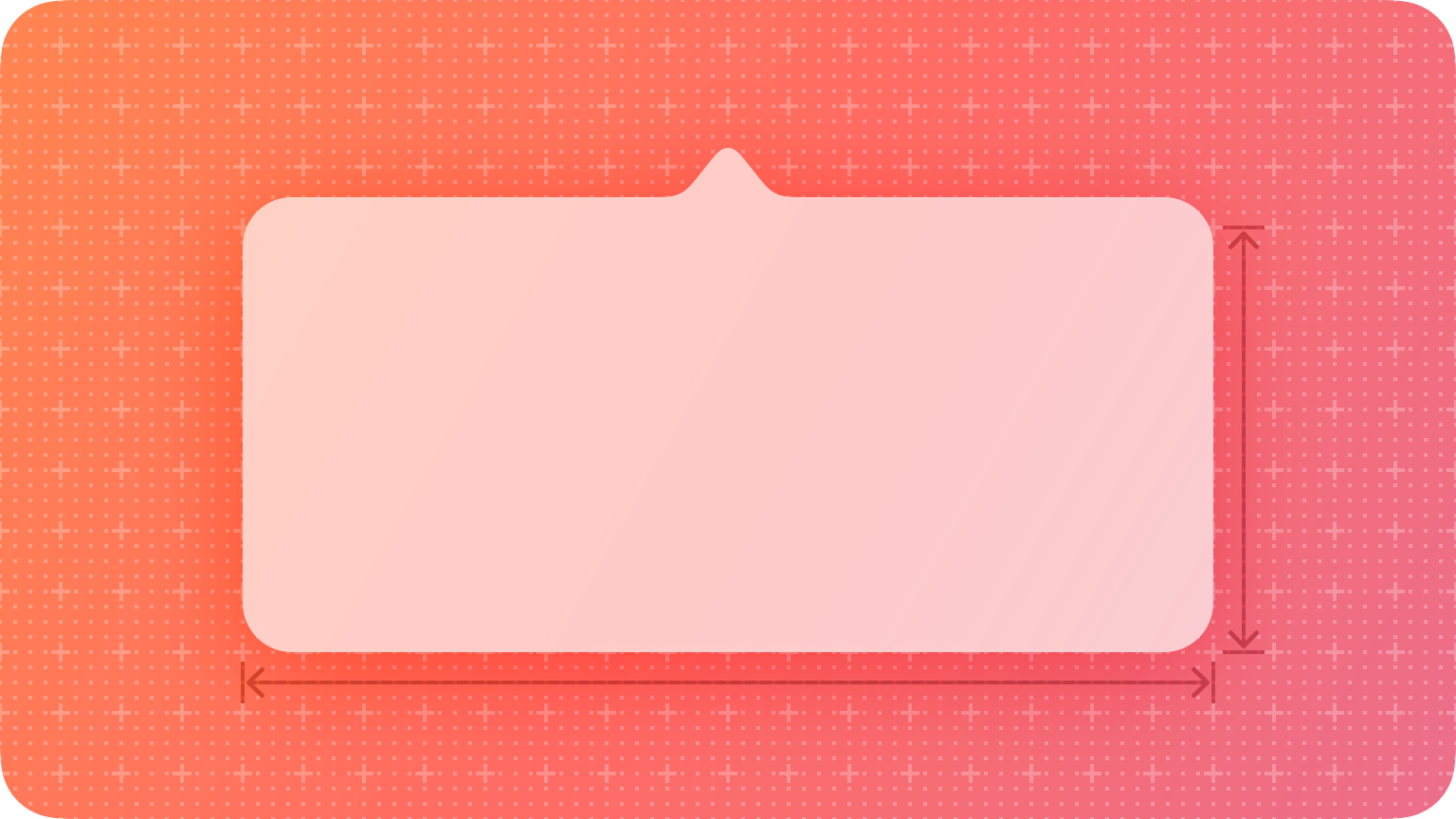
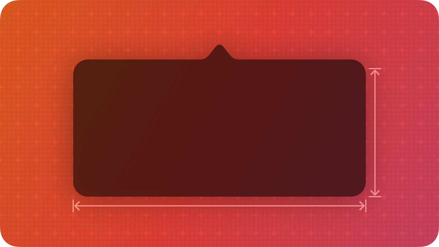
Position popovers appropriately onscreen. Make sure a popover’s arrow points as directly as possible to the element that revealed it. Ideally, a popover doesn’t cover the element that revealed it or any essential content people may need to see while using it.
Use a Close button for confirmation and guidance only. A Close button, including Cancel or Done, is worth including if it provides clarity, like exiting with or without saving changes. Otherwise, a popover generally closes when people click or tap outside its bounds or select an item in the popover. If multiple selections are possible, make sure the popover remains open until people explicitly dismiss it or they click or tap outside its bounds.
Always save work when automatically closing a nonmodal popover. People can unintentionally dismiss a nonmodal popover by clicking or tapping another part of the screen. Discard work only when people click or tap an explicit Cancel button.
Show one popover at a time. Displaying multiple popovers clutters the interface and causes confusion. Never show a cascade or hierarchy of popovers, in which one emerges from another. If you need to show a new popover, close the open one first.
Don’t show another view over a popover. Make sure nothing displays on top of a popover, except for an alert.
When possible, let people close one popover and open another with a single click or tap. Avoiding extra gestures is especially desirable when several different bar buttons each open a popover.
Avoid making a popover too big. Make a popover only big enough to display its contents and point to the place it came from — rather than take over the entire screen. Be aware that the system might adjust the size of a popover to ensure it fits well onscreen.
Provide a smooth transition when changing the size of a popover. Some popovers provide both condensed and expanded views of the same information. If you adjust the size of a popover, animate the change to avoid giving the impression that a new popover replaced the old one.
Avoid using the word popover in help documentation. Instead, refer to a specific task or selection. For example, instead of “Select the Show button at the bottom of the popover,” you might write “Select the Show button.”
Avoid using a popover to show a warning. People can easily or accidentally dismiss popovers. Use alerts to warn people instead.
Platform considerations
Not supported in tvOS or watchOS.
iOS, iPadOS
Avoid displaying popovers in compact views. Make your app or game dynamically adjust its layout based on the size class of the content area. Reserve popovers for wide views; for compact views, use all available screen space by presenting information in a full-screen modal view like a sheet instead. For related guidance, see Modality.
macOS
You can make a popover detachable in macOS, which becomes a separate panel when people drag it. The panel remains visible onscreen while people interact with other content.

Consider letting people detach a popover. People might appreciate being able to convert a popover into a panel if they want to view other information while the popover remains visible.
Make minimal appearance changes to a detached popover. A panel that looks similar to the original popover helps people maintain context.