Widgets
A widget elevates a small amount of timely, personally relevant information from your app or game, displaying it where people can see it at a glance.
Widgets display app content without requiring people to open your app. Useful and delightful, widgets can also help people make their devices more personal. For developer guidance, see Creating a widget extension.
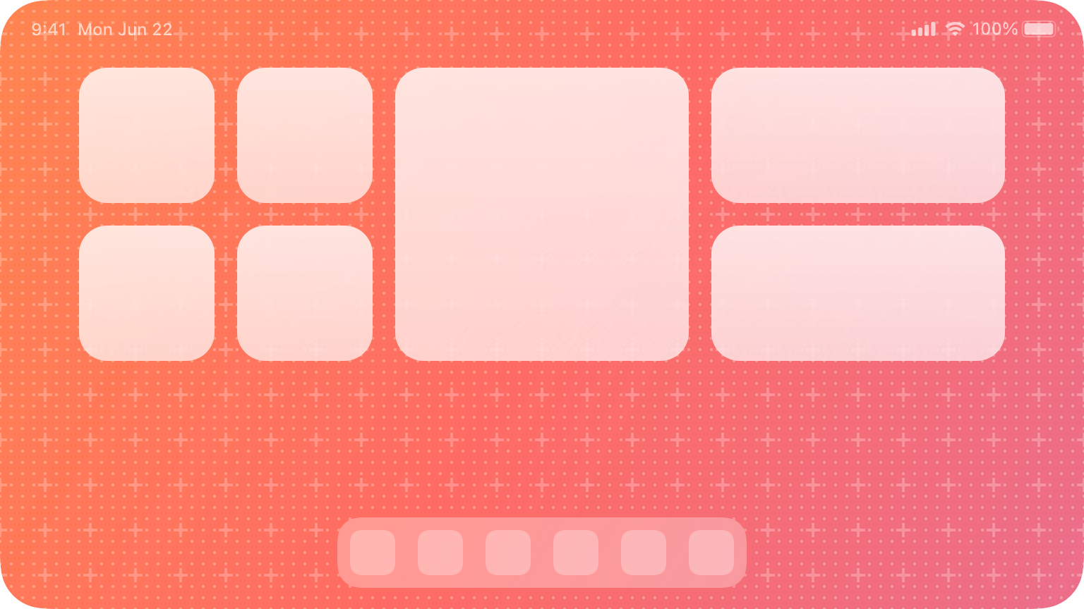
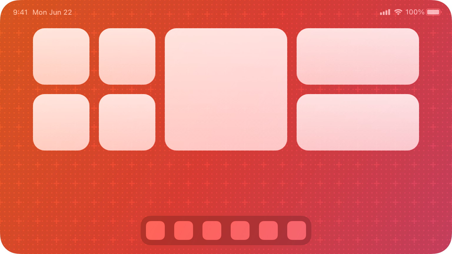
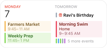
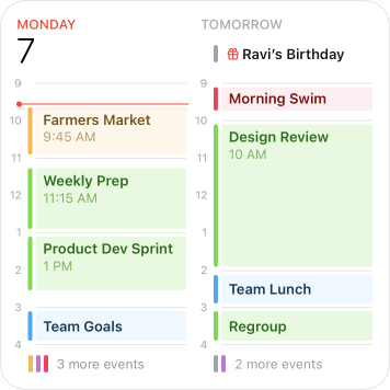
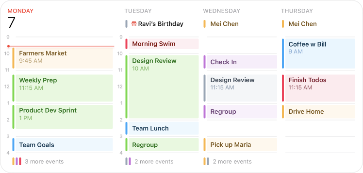
In iOS and iPadOS, widgets appear on the Home Screen or in Today View; in macOS, Notification Center displays widgets. Widgets can be small, medium, large, and — in iPadOS only — extra large.
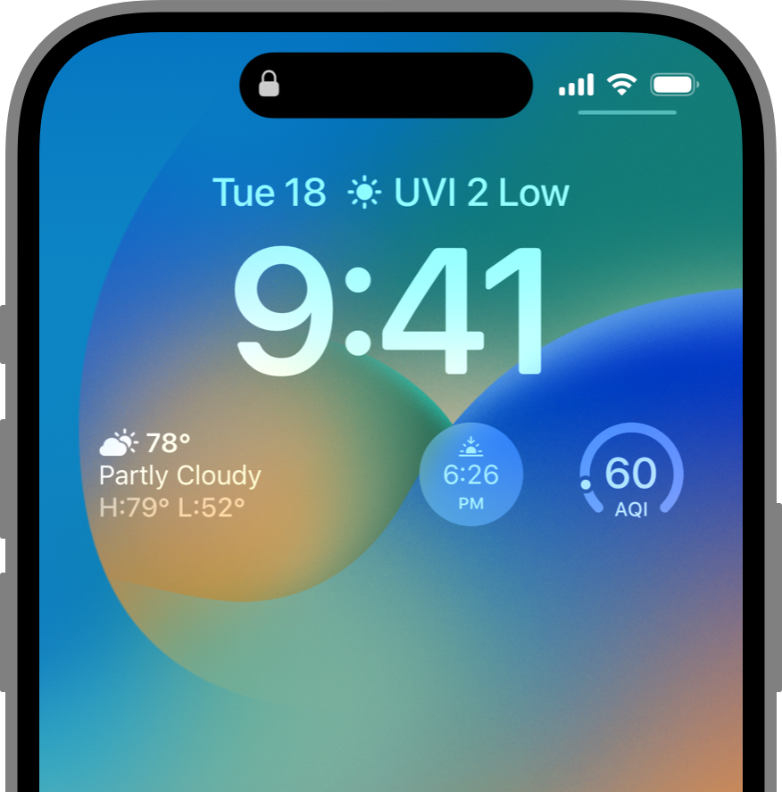
iOS 16 introduces widgets on the Lock Screen, which let people place rich, glanceable content on their iPhone Lock Screen in a way that’s similar to placing a complication on their Apple Watch face. Lock Screen widgets are also similar to complications in both design and implementation. For guidance, see Platform considerations below.
The widget gallery helps people find the widgets they want in the sizes that work for them. The gallery’s editing mode lets people make changes to editable widgets, such as changing the location in a Weather widget or selecting a topic in a News widget. The widget gallery is available in Today View and Home Screen editing mode in iOS and iPadOS. It’s also available in Lock Screen editing mode in iOS and in Notification Center editing mode in macOS.
In iOS and iPadOS, the widget gallery also supports widget stacks, including a Smart Stack. A stack contains up to 10 same-size widgets; people view one widget at a time by scrolling through the stack. A Smart Stack automatically rotates through the stack of widgets, displaying the widget most likely to be relevant in the current context. Smart Stacks aren't available on the Lock Screen on iPhone and iPad.
Siri can add a suggested widget to the Smart Stack when it’s likely that people are interested in it. A suggested widget doesn’t stay in the Smart Stack unless people choose to keep it. For developer guidance, see Increasing the visibility of widgets in Smart Stacks.
Best practices
The first step in the design process is to choose a single idea for your widget. Throughout the process, use that idea to keep the widget’s content focused and relevant.
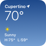
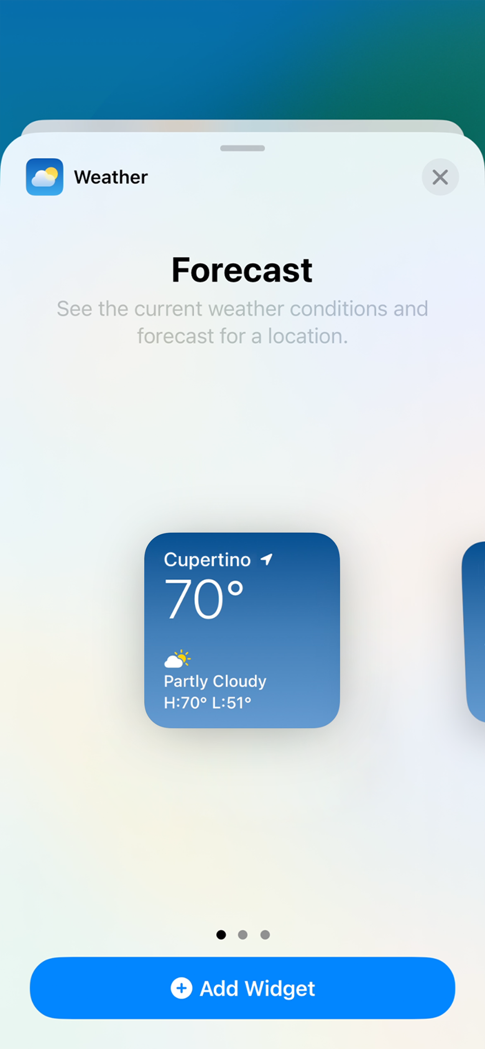
Look for a simple idea that’s clearly related to your app’s main purpose. For example, the widget for Weather shows current high and low temperatures plus the current weather conditions. This is the information most people who use the Weather app are primarily interested in. Alternatively, another weather app might offer people the ability to see other types of weather data such as pressure, humidity, or wind speed.
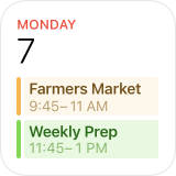
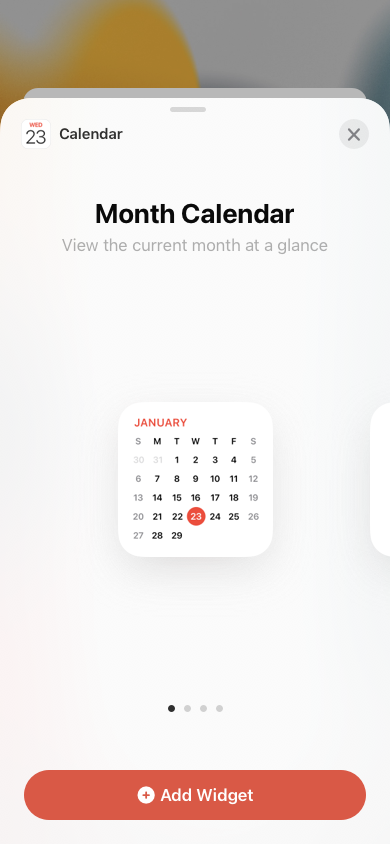
In each size, display only the information that’s directly related to the widget’s main purpose. In larger widgets, you can display more data — or more detailed visualizations of the data — but it’s crucial to stay focused on the widget’s purpose. For example, all Calendar widgets display a person’s upcoming events. In each size from small to extra large, the widget maintains its focus on events while expanding the range of information as the size increases.
Avoid creating a widget that only launches your app. People appreciate widgets because they provide instant access to meaningful content. A widget that behaves like an app icon offers no additional value, which means people are likely to remove it from their screens.
Offer your widget in multiple sizes when doing so adds value. In general, avoid simply expanding a smaller widget’s content to fill a larger area. It’s more important to create one widget in the size that works best for the content you want to display than it is to provide the widget in all sizes.
Prefer dynamic information that changes throughout the day. If a widget’s content never appears to change, people may not keep it in a prominent position. Although widgets don’t update from minute to minute, it’s important to find ways to keep their content fresh to invite frequent viewing.
Look for opportunities to surprise and delight. For example, you might design a unique visual treatment for your calendar widget to display on meaningful occasions, like birthdays or holidays.

Updating widget content
To remain relevant and useful, widgets periodically refresh their information. Widgets don’t support continuous, real-time updates, and the system may adjust the limits for updates depending on various factors.
Keep your widget up to date. Finding the appropriate update frequency for your widget depends on knowing how often the data changes and estimating how often people need to see new data. For example, a widget that helps people track tides at a beach could provide useful information on an hourly basis, even though tide conditions change constantly. If people are likely to check your widget more frequently than you can update it, consider displaying text that describes when the data was last updated. For developer guidance, see Keeping a widget up to date.
Let the system update dates and times in your widget. Widget update frequency is limited, and you can preserve some of your update opportunities by letting the system refresh date and time information.
Show content quickly. When you determine the update frequency that fits with the data you display, you don’t need to hide stale data behind placeholder content.
Interactivity
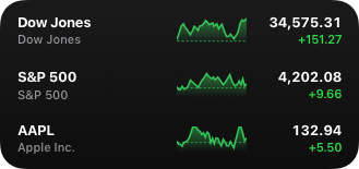
In some cases, people need to edit a widget to ensure it displays the information that’s most useful for them. For example, people choose a stock symbol for a Stocks Symbol widget. In contrast, some widgets — like the Podcasts widget — automatically display recent content, so people don’t need to customize them.
Make editable widgets easy for people to customize. If your widget is editable, avoid requiring too many settings or asking for information that might be hard for people to find. You don’t have to design an editing-mode user interface for your widget because the system automatically generates it for you. For developer guidance, see Making a configurable widget.
Ensure that a widget interaction opens your app at the right location. When people interact with your widget, it deep links into your app, where you can offer details and actions that directly relate to the widget’s content. Avoid making people navigate to the relevant area. For example, when people click or tap a Stocks Symbol widget, the Stocks app opens to a page that displays information about that symbol. Similarly, when people click or tap a small Stocks Watchlist widget, the app opens to show the complete watchlist. When people click or tap one symbol in a larger version of the Watchlist widget, Stocks open to show that symbol.
Avoid defining too many interaction targets. A small widget supports a single target, but larger widgets can offer multiple targets. For example, the medium Notes widget can display several notes. When people click or tap one of them, the app opens to display that note. Although multiple interaction targets might make sense for your content, avoid offering so many that people have to spend time choosing the one they want.
Let people know when authentication adds value. If your widget provides additional functionality when someone is signed in to your app, make sure people know that. For example, an app that shows upcoming reservations might include a message like “Sign in to view reservations” when people are signed out.
Interface design
Widgets use vivid colors, rich images, and clear, crisp text that’s easy to read at a glance. A unique, beautiful widget not only provides useful information, it also can encourage people to feature it on their devices.
Help people recognize your widget by including design elements linked to your brand’s identity. Design elements like brand colors, typeface, and stylized glyphs can make a widget instantly recognizable. Take care to keep brand-related design elements from crowding out useful information or making your widget look out of place on the Home Screen.
NOTE When a widget appears in Notification Center in macOS or on the Home Screen in iOS, the system displays the app name below it. In Today View, the Lock Screen on iPhone, and the Home Screen in iPadOS, the app name doesn’t appear below a widget.
Consider carefully before displaying a logo, wordmark, or app icon in your widget. When you include brand-related design elements like colors and fonts, people seldom need your logo or app icon to help them recognize your widget. Also, the widget gallery displays your app name and icon when it lists the various types and sizes of widgets you offer. In some widgets — for example, those that display content from multiple sources — it may make sense to include a small logo in the top-right corner to subtly identify the app that provides the widget.
Aim for a comfortable density of information. When content appears sparse, the widget can seem unnecessary; when content is too dense, the widget isn’t glanceable. If you have lots of information to include, avoid letting your widget become a collage of items that are difficult to parse. Seek ways to curate the content so that people can grasp the essential parts instantly and view relevant details at a longer look. You might also consider creating a larger widget and looking for places where you can replace text with graphics without losing clarity.
Use color judiciously. Beautiful colors draw the eye, but they’re best when they don’t prevent people from absorbing a widget’s information at a glance. Use color to enhance a widget’s appearance without competing with its content. In your asset catalog, you can also specify the colors you want the system to use as it generates your widget’s editing-mode user interface.
Support Dark Mode. Ideally, a widget looks great in both the light and dark appearances. In general, avoid displaying dark text on a light background for the dark appearance, or light text on a dark background for the light appearance. When you use the semantic system colors for text and backgrounds, the colors dynamically adapt to the current appearance. You can also support different appearances by putting color variants in your asset catalog. For guidance, see Dark Mode; see Asset management and Supporting Dark Mode in your interface.

Consider using the system font and SF Symbols. Using the system font helps your widget look at home on any platform, while making it easier for you to display great-looking text in a variety of weights, styles, and sizes. Use SF Symbols to align and scale symbols with text that uses the system font. If you need to use a custom font, consider using it sparingly, and be sure it’s easy for people to read at a glance. It often works well to use a custom font for the large text in a widget and SF Pro for the smaller text. For guidance, see Typography and SF Symbols.
Avoid using very small font sizes. In general, display text using fonts at 11 points or larger. Text in a font that’s smaller than 11 points can be too small for most people to read at a glance.
Always use text elements in a widget to ensure that your text scales well. In particular, don’t rasterize text — doing so prevents VoiceOver from speaking your content.
Design a realistic preview to display in the widget gallery. Highlighting your widget’s capabilities — and clearly representing the experiences each widget type or size can provide — helps people make an informed decision. You can display real data in your widget preview, but if the data takes too long to generate or load, display realistic simulated data instead.
Design placeholder content that helps people recognize your widget. An installed widget displays placeholder content while its data loads. You can create an effective placeholder appearance by combining static interface components with semi-opaque shapes that stand in for dynamic content. For example, you can use rectangles of different widths to suggest lines of text, and circles or squares in place of glyphs and images.

Avoid mirroring your widget’s appearance within your app. If your app displays an element that looks like your widget but doesn’t behave like it, people can be confused when the element responds differently when they interact with it. Also, people may be less likely to try other ways to interact with such an element in your app because they expect it to behave like a widget.
Write a succinct description of your widget. The widget gallery displays descriptions that help people understand what each widget does. It generally works well to begin a description with an action verb — for example, “See the current weather conditions and forecast for a location” or “Keep track of your upcoming events and meetings.” Avoid including unnecessary phrases that reference the widget itself, like “This widget shows...,” “Use this widget to...,” or “Add this widget.” Use approachable language and sentence-style capitalization.
Group your widget’s sizes together, and provide a single description. If your widget is available in multiple sizes, group the sizes together so people don’t think each size is a different widget. Provide a single description of your widget — regardless of how many sizes you offer — to avoid repetition and to help people understand how each size provides a slightly different perspective on the same content and functionality.
Consider coloring the Add button. After people choose your app in the widget gallery, an Add button appears below the group of widgets you offer. You can specify a color for this button to help remind people of your brand.
Adapting to different screen sizes
Widgets scale to adapt to the screen sizes of different devices and onscreen areas. Ensure that your widget looks great on every device by supplying content at appropriate sizes.
Design content to look great on all devices and scale factors, letting the system resize or scale as necessary. In iOS, the system ensures that your widget looks good on small devices by resizing the content you design for large devices. In iPadOS, the system renders your widget at a large size before scaling it down for display on the Home Screen. As you create design comprehensives for various devices and scale factors, use the values listed in Specifications for guidance; for your production widget, use SwiftUI to ensure flexibility.
Coordinate the corner radius of your content with the corner radius of the widget. To ensure that your content looks good within a widget’s rounded corners, use a SwiftUI container to apply the correct corner radius. For developer guidance, see ContainerRelativeShape.
NOTE In iOS, widgets support Dynamic Type sizes from Large to AX5 when you use Font to choose a system font or custom(_:size:) to choose a custom font.
In general, use standard margins to ensure your content is comfortably legible. The standard margin width is 16 points. If your widget displays content like text, glyphs, and graphs, use the standard margins to avoid crowding the edges and creating a cluttered appearance. For developer guidance, see padding(_:_:). If you use background shapes to create visual content groupings, or if you display button backgrounds, you might need to use tight margins. Tight margins — which measure 11 points in width — can also help make graphics that contain information easier for people to read.
Platform considerations
No additional considerations for iPadOS or macOS. Not supported in tvOS or watchOS.
iOS
Widgets on the Lock Screen are functionally similar to watch complications and follow design principles for complications in addition to design principles for widgets. Both support Always-On display and emphasize glanceable content within their limited space. Provide useful information in your Lock Screen widget, and don’t treat it only as an additional way for people to launch into your app. Additionally, the vibrant rendering mode that widgets on the Lock Screen use is similar to the accented rendering mode for watch complications because they both communicate information without relying on color only. In many cases, a design for complications also works well for widgets on the Lock Screen (and vice versa), so consider creating them in tandem.
Your app can offer widgets on the Lock Screen in three different shapes: as inline text that appears above the clock and circular and rectangular shapes that appear below the clock.
As with complications, aim to create widgets on the Lock Screen that are informative, dynamic, and display up-to-date information.
Adjust colors and images for the vibrant rendering mode. The system renders widgets on the Lock Screen using a vibrant, blurred appearance. The opacity of pixels within your image determines the strength of the blurred material effect. Fully transparent pixels let the background wallpaper pass through as is. When creating assets for the Lock Screen, render content like images, numbers, or text at full opacity. The brightness of pixels determines how vibrant they appear on the Lock Screen: Brighter gray values provide more contrast, and darker values provide less contrast. To establish hierarchy, use white or light gray for the most prominent content and darker grayscale values for secondary elements.
To make sure images look great in the vibrant rendering mode:
- Confirm that your images' content has sufficient contrast in grayscale.
- Use opaque grayscale values, rather than opacities of white, to achieve the best vibrant material effect.
Support Always-On display. Devices with Always-On display render widgets on the Lock Screen with reduced luminance. Use levels of gray that provide enough contrast in Always-On display, and make sure your content is legible.
For developer guidance, see Creating Lock Screen widgets and watch complications, WidgetRenderingMode, and vibrant.
Specifications
iOS widget design comprehensives
| Screen size (portrait, pts) | Small (pts) | Medium (pts) | Large (pts) | Circular (pts) | Rectangular (pts) | Inline (pts) |
|---|---|---|---|---|---|---|
| 430×932 | 170x170 | 364x170 | 364x382 | 76x76 | 172x76 | 257x26 |
| 428x926 | 170x170 | 364x170 | 364x382 | 76x76 | 172x76 | 257x26 |
| 414x896 | 169x169 | 360x169 | 360x379 | 76x76 | 160x72 | 248x26 |
| 414x736 | 159x159 | 348x157 | 348x357 | 76x76 | 170x76 | 248x26 |
| 393x852 | 158x158 | 338x158 | 338x354 | 72x72 | 160x72 | 234x26 |
| 390x844 | 158x158 | 338x158 | 338x354 | 72x72 | 160x72 | 234x26 |
| 375x812 | 155x155 | 329x155 | 329x345 | 72x72 | 157x72 | 225x26 |
| 375x667 | 148x148 | 321x148 | 321x324 | 68x68 | 153x68 | 225x26 |
| 360x780 | 155x155 | 329x155 | 329x345 | 72x72 | 157x72 | 225x26 |
| 320x568 | 141x141 | 292x141 | 292x311 | n/a | n/a | n/a |
iPadOS widget design comprehensives
| Screen size (portrait, pts) | Target | Small (pts) | Medium (pts) | Large (pts) | Extra large (pts) |
|---|---|---|---|---|---|
| 768x1024 | Canvas | 141x141 | 305.5x141 | 305.5x305.5 | 634.5x305.5 |
| Device | 120x120 | 260x120 | 260x260 | 540x260 | |
| 744x1133 | Canvas | 141x141 | 305.5x141 | 305.5x305.5 | 634.5x305.5 |
| Device | 120x120 | 260x120 | 260x260 | 540x260 | |
| 810x1080 | Canvas | 146x146 | 320.5x146 | 320.5x320.5 | 669x320.5 |
| Device | 124x124 | 272x124 | 272x272 | 568x272 | |
| 820x1180 | Canvas | 155x155 | 342x155 | 342x342 | 715.5x342 |
| Device | 136x136 | 300x136 | 300x300 | 628x300 | |
| 834x1112 | Canvas | 150x150 | 327.5x150 | 327.5x327.5 | 682x327.5 |
| Device | 132x132 | 288x132 | 288x288 | 600x288 | |
| 834x1194 | Canvas | 155x155 | 342x155 | 342x342 | 715.5x342 |
| Device | 136x136 | 300x136 | 300x300 | 628x300 | |
| 954x1373 * | Canvas | 162x162 | 350x162 | 350x350 | 726x350 |
| Device | 162x162 | 350x162 | 350x350 | 726x350 | |
| 970x1389 * | Canvas | 162x162 | 350x162 | 350x350 | 726x350 |
| Device | 162x162 | 350x162 | 350x350 | 726x350 | |
| 1024x1366 | Canvas | 170x170 | 378.5x170 | 378.5x378.5 | 795x378.5 |
| Device | 160x160 | 356x160 | 356x356 | 748x356 | |
| 1192x1590 * | Canvas | 188x188 | 412x188 | 412x412 | 860x412 |
| Device | 188x188 | 412x188 | 412x412 | 860x412 |
* When Display Zoom is set to More Space.


