Accessibility
People use Apple’s accessibility features to personalize how they interact with their devices in ways that work for them.
An accessible app or game supports accessibility personalizations by design and gives everyone a great user experience, regardless of their capabilities or how they use their devices.
Approximately one in seven people have a disability that affects the way they interact with the world and their devices. People can experience disabilities at any age, for any duration, and at varying levels of severity. For example, situational disabilities — such as a wrist injury from a fall or voice loss from overuse — can affect the way almost everyone interacts with their devices at various times.
Best practices
Design with accessibility in mind. Accessibility is not just about making information available to people with disabilities — it’s about making information available to everyone, regardless of their capabilities or situation. Designing your app with accessibility in mind means prioritizing simplicity and perceivability and examining every design decision to ensure that it doesn’t exclude people who have different abilities or interact with their devices in different ways.
Simplicity — Enabling familiar, consistent interactions that make complex tasks simple and straightforward to perform.
Perceivability — Making sure that all content can be perceived whether people are using sight, hearing, or touch.
Support personalization. You already design your experience to adapt to environmental variations — such as device orientation, screen size, resolution, color gamut, and split view — because you want people to enjoy it in any context and on all supported devices. With minimal additional effort, you can design your app to support the accessibility features people use to personalize the ways they interact with their devices.
When you use standard components to implement your interface, text and controls automatically adapt to several accessibility settings, such as Bold Text, Larger Text, Invert Colors, and Increase Contrast.
Audit and test your app or game for accessibility. An audit examines every element in your experience and gives you a comprehensive list of issues to fix. Testing helps you ensure that everyone can complete the most important tasks in your app, no matter how they interact with their devices.
When you test important user flows with accessibility features turned on, you gain an appreciation for the challenges of interacting with a device in different ways. You also discover places where your app might fail to deliver a great user experience.
For example, a common user flow in a social media app might be “post a response to a comment.” The tasks that make up this flow could include:
- Read posted comments
- Choose a comment for a response
- Open the response view
- Edit the response
- Post the response
For each critical user flow in your app or game, turn on an accessibility feature, such as VoiceOver, Reduce Motion, or Large Text Size, and make sure that you can complete every task in the flow without difficulty. After you fix the problems you uncover, turn on a different accessibility feature and run through the user flow again. To help you audit, test, and fix your app or game, consider using Xcode’s Accessibility Inspector.
Interactions
Assistive technologies like VoiceOver, and accessibility features like display accommodations, expand the ways people can interact with their devices. Because these technologies and features integrate with system-provided interactions, it’s essential that you support the system interactions correctly in your app.
Gestures
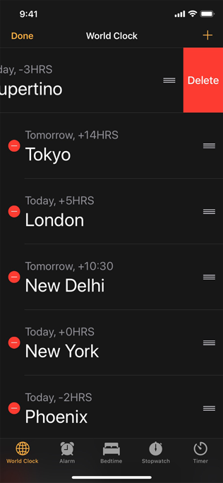
Don’t override the platform gestures. People expect system gestures — such as swiping down to reveal Notification Center or the macOS trackpad gestures available in System Settings — to work regardless of the app they’re using.
Prefer simplified gestures for common interactions. Complex gestures such as multifinger gestures, long presses, or repeated button presses can be challenging for many people. Using the simplest gestures possible improves the experience for everyone who interacts with your app.
Provide alternative ways to perform gesture-based actions. Include an option for people who may not be able to perform a specific gesture. For example, if swiping deletes a row in a table, you can also provide an alternative way to delete items through an edit mode or by offering a Delete button in an item detail view.
When possible, make your app’s core functionality accessible through more than one type of physical interaction. For example, Camera on iPhone and iPad lets people take a photo by tapping the onscreen button or by pressing the device's volume down button. In addition to making photo-capture more convenient for everyone, these alternative interactions provide options to people who might have limited grip strength or dexterity.
Make drag and drop accessible in your iOS or iPadOS app. When you use the accessibility APIs to identify drag sources and drop targets in your app, assistive technologies can help people drag and drop onscreen items. For developer guidance, see accessibilityDragSourceDescriptors and accessibilityDropPointDescriptors.
Buttons and controls
Give all touchscreen controls and interactive elements a hit target that measures at least 44x44 pt. People with limited mobility need larger hit targets to help them interact with your app. It can be frustrating to interact with too-small controls in any platform, even when people use a pointer.
Characterize the accessibility of custom elements. You can use system APIs to tell assistive technologies how a component behaves. For example, using button or NSAccessibilityButton to characterize a view as a button means that VoiceOver speaks the view’s description followed by the word button, which tells people that the view behaves like a button.
Use a consistent style hierarchy to communicate the relative importance of buttons. When you use a consistent hierarchy of button styles, people can grasp the importance of buttons based on their appearance. In iOS, iPadOS, and tvOS, for example, you can use the visually prominent filled style for the button that performs the most likely action in a view, using less prominent styles — such as gray or plain — for buttons that enable less important actions. (For developer guidance, see UIButton.Configuration.) People can also turn on Button Shapes to make it easier to distinguish active buttons from surrounding content.
Prefer the system-provided switch component. SwiftUI provides a switch that indicates its state by the position of its knob and its fill color. For some people, however, the addition of labels makes it easier to perceive whether a switch is on or off. When you use system-provided switches, iOS, iPadOS, tvOS, and watchOS automatically displays on/off glyphs within them when people turn on On/Off Labels.
Without on/off labels

With on/off labels
Consider giving links a visual indicator in addition to color, such as an underline. It’s fine to use color to identify a link, but if you use it as the only indicator, people — such as those with color blindness or cognitive or situational attention impairments — may not be able to perceive the distinction.
User input
Let people input information by speaking instead of typing. Adding a dictation button in a text entry field lets people choose speech as their preferred input method. If you create a custom keyboard, be sure to include a microphone key for dictation.
Support Siri or Shortcuts for performing important tasks by voice alone. To learn more about enabling Siri interactions in your app, see Siri.
When possible, don’t prevent people from selecting plain text. Many people rely on using selected text as input for translations and definitions.
Haptics
Support the system-defined haptics. Many people rely on haptics to help them interact with apps when they can’t see the screen. For example, system apps play haptics to notify people when a task has succeeded or failed or when an event is about to happen. Be sure to use the system-defined haptics consistently in your app so that you don’t confuse people. For guidance, see Playing haptics.
VoiceOver
VoiceOver gives audible descriptions of onscreen content, helping people get information and navigate when they can’t see the screen.
Content descriptions
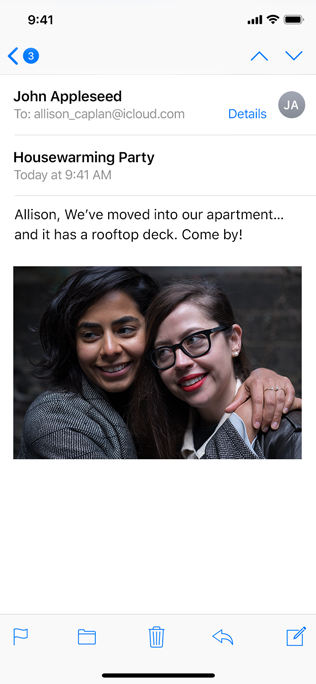
Provide alternative descriptions for all images that convey meaning. If you don’t describe the meaningful images in your content, you prevent VoiceOver users from fully experiencing your app. To create a useful description, start by reporting what would be self-explanatory to someone who is able to see the image. Because VoiceOver reads the text surrounding the image and any captions, focus your description on information that’s conveyed by the image itself.
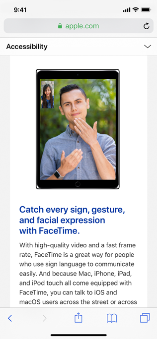
The alternative description for this image is “Man and woman signing on FaceTime.”
Make infographics fully accessible. Provide a concise description of the infographic that explains what it conveys. If people can interact with the infographic to get more or different information, you need to make these interactions available to VoiceOver users, too. The accessibility APIs provide ways to represent custom interactive elements so that assistive technologies can help people use them.
When an image is purely decorative and isn't intended to communicate anything, hide it from assistive technologies. Making VoiceOver describe a purely decorative image can waste people’s time and add to their cognitive load without providing any benefit.
Give each screen a unique title and provide headings that identify sections in your information hierarchy. When people arrive on a screen, the title is the first piece of information they receive from an assistive technology. To help people understand the structure of your app, create a unique title for each screen that succinctly describes its contents or purpose. Similarly, people need accurate section headings to help them build a mental map of the information hierarchy of each screen.
Help everyone enjoy your video and audio content. When you provide closed captions, audio descriptions, and transcripts, you can help people benefit from audio and video content in ways that work for them.
Closed captions give people a textual equivalent for the audible information in a video. You can also use closed captions to provide multiple translations for the same content, letting the system choose the version that matches the device’s current settings. Because closed captions aren’t always available, it’s important to provide subtitles, too.
Audio descriptions provide a spoken narration of important information that’s presented only visually.
A transcript provides a complete textual description of a video, covering both audible and visual information, so that people can enjoy the video in different ways.
For developer guidance, see Selecting subtitles and alternative audio tracks.
Navigation
Make sure VoiceOver users can navigate to every element. VoiceOver uses accessibility information from onscreen elements to help people understand the location of each element and what it can do. System-provided UI components include this accessibility information by default, but VoiceOver can’t help people discover and use custom elements unless you provide the information. For developer guidance, see Accessibility modifiers.
Improve the VoiceOver experience by specifying how elements should be grouped, ordered, or linked. Proximity, alignment, and other contextual cues can help sighted people perceive the relationships among onscreen elements, but these cues don’t work well for VoiceOver users. Examine your app for places where relationships among elements are visual only, and describe these relationships to VoiceOver.
For example, the layout below relies on proximity and centering to imply that each phrase is a caption for the image above it. However, if you don’t tell VoiceOver that each image should be grouped with its phrase, VoiceOver reads, “A large container holding a variety of mangoes. A large container holding many green artichokes. Mangoes come from trees that belong to the genus Mangifera. Artichokes come from a variety of a species of thistle.” This happens because VoiceOver reads elements from top to bottom by default. For developer guidance, see shouldGroupAccessibilityChildren and accessibilityTitleUIElement.

Mangoes come from trees that belong to the genus Mangifera.

Artichokes come from a variety of a species of thistle.
Tell VoiceOver when onscreen content or layout changes. An unexpected change in content or layout can be very confusing to VoiceOver users, because it means that their mental map of the screen is no longer accurate. It’s crucial to report onscreen changes so that VoiceOver and other assistive technologies can help people update their understanding of the screen. For developer guidance, see UIAccessibility.Notification (UIKit) or NSAccessibility.Notification (AppKit).
Help people predict when a control opens a different webpage or app. An unexpected change in context can cause confusion and require people to suddenly rebuild their mental model of the onscreen environment. One way to draw attention to a potential change in context is append an ellipsis to a button’s title. Throughout the system, an ellipsis trailing the title is the standard way for a button to communicate that it opens another window or view in which people can complete the action. For example, Mail in iOS and iPadOS appends an ellipsis to the Move Message button, signaling that a separate view opens, listing the destinations people can choose.
Provide alternative text labels for all important interface elements. Alternative text labels aren’t visible onscreen, but they let VoiceOver audibly describe onscreen elements, making navigation easier for people with visual disabilities. System-provided controls have useful labels by default, but you need to create labels for custom elements. For example, if you create an accessibility element that represents a custom rating button, you might supply the label “Rate.”
Support the VoiceOver rotor when necessary. VoiceOver users can use an onscreen control called the rotor to navigate a document or webpage by headings, links, or other section types. The rotor can also bring up the braille keyboard. You can help VoiceOver users navigate among related items in your app by identifying these items to the rotor. For developer guidance, see UIAccessibilityCustomRotor and NSAccessibilityCustomRotor.
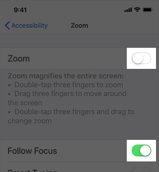
In iPadOS and macOS, make sure people can use the keyboard to navigate and interact with all onscreen components in your app. Ideally, people can turn on Full Keyboard Access and perform every task in your experience using only the keyboard. In addition to accessibility keyboard shortcuts, the system defines a large number of other keyboard shortcuts that many people use all the time. To support all users, it’s important to avoid overriding any system-defined keyboard shortcuts in your app. For guidance, see Keyboards.
Text display
In iOS, iPadOS, tvOS, and watchOS, use Dynamic Type and test that your app’s layout adapts to all font sizes. Dynamic Type lets people pick the font size that works for them. Verify that your design can scale and that both text and glyphs are legible at all font sizes. On iPhone or iPad, for example, turn on Larger Accessibility Text Sizes in Settings > Accessibility > Display & Text Size > Larger Text, and make sure your app remains comfortably readable. You can download the Dynamic Type size tables in the Sketch, Photoshop, and Adobe XD Apple Design Resources for each platform.
As font size increases, keep text truncation to a minimum. In general, aim to display as much useful text in the largest accessibility font size as you do in the largest standard font size. Avoid truncating text in scrollable regions unless people can open a separate view to read the rest of the content. You can prevent text truncation in a label by configuring it to use as many lines as needed to display a useful amount of text; for developer guidance, see numberOfLines.
Consider adjusting layout at large font sizes. When font size increases, inline items and container boundaries can crowd text, making it less readable. For example, if you display text inline with secondary items — such as glyphs or timestamps — the text has less horizontal space. At large font sizes, an inline layout might cause text to truncate or result in overlapping text and secondary items. In this case, consider using a stacked layout where the text appears above the secondary items. Similarly, multiple columns of text can become less readable at large font sizes because each column constrains horizontal space. In this case, consider reducing the number of columns when font size increases to avoid text truncation and improve overall readability. For developer guidance, see isAccessibilityCategory.

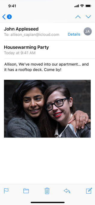
At smaller text sizes, Mail displays the date inline with the sender’s name.
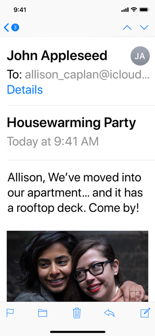
At the largest accessibility text size, Mail displays the date below the recipient’s name.
Increase the size of meaningful interface icons as font size increases. If you use interface icons to communicate important information, make sure they are easy to view at larger font sizes, too. When you use SF Symbols, you get icons that scale automatically with Dynamic Type size changes.
Maintain a consistent information hierarchy regardless of the current font size. For example, keep primary elements toward the top of the screen even when the font size is very large, so that people don’t lose track of these elements.
Prefer regular or heavy font weights in your app. Consider using Regular, Medium, Semibold, or Bold font weights, because they are easier to see. Avoid Ultralight, Thin, and Light font weights, which can be more difficult to see.
Ensure your app responds correctly and looks good when people enable bold text. In iOS, iPadOS, tvOS, and watchOS, people turn on the bold text accessibility setting to make text and symbols easier to see. In response, your app should make all text bolder and give all glyphs an increased stroke weight. The system fonts and SF symbols automatically adjust to the bold text accessibility setting.
Make sure custom fonts are legible. Custom typefaces can sometimes be difficult to read. Unless your app has a compelling need for a custom font, such as for branding purposes or to create an immersive gaming experience, it’s usually best to use the system fonts. If you do use a custom font, make sure it’s easy to read, even at small sizes.
Avoid full text justification. The whitespace created by fully justified text can create patterns that make it difficult for many people to read and focus on the text. Left justification — or right justification in right-to-left languages — provides a framing reference for people with learning and literacy challenges, such as dyslexia.
Avoid using italics or all caps for long passages of text. Italics and all caps are great for occasional emphasis, but overuse of these styles makes text hard to read.
Color and effects
Don’t rely solely on color to differentiate between objects or communicate important information. If you use color to convey information, be sure to provide text labels or glyph shapes to help everyone perceive it.
Prefer system colors for text. When you use system colors in text, it responds correctly to accessibility settings such as Invert Colors and Increase Contrast.
Avoid using color combinations as the only way to distinguish between two states or values. Many colorblind people find it difficult to distinguish blue from orange; other problematic combinations are red and green, red and black, and either red or green combined with gray. When it makes sense to use a combination of colors to communicate states or values, include additional visual indicators so everyone can perceive the information. For example, instead of using red and green circles to indicate offline and online, you could use a red square and a green circle. Some image-editing software includes tools that can help you proof for colorblindness.
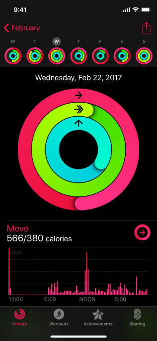
As seen without colorblindness.
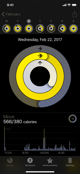
As seen with red-green colorblindness.
Ensure your views respond correctly to Invert Colors. People can turn on Invert Colors when they prefer to view items on a dark background. In the Smart Invert mode of Invert Colors, images, video, and full-color icons (such as app icons and nontemplate images) don’t invert, and dark UI stays dark. Test your app or game to find places where you might need to prevent an image — like a photo in a custom view — from inverting.
Use strongly contrasting colors to improve readability. Many factors affect the perception of color, including font size and weight, color brightness, screen resolution, and lighting conditions. When you increase color contrast of visual elements like text, glyphs, and controls, you can help more people use your app in more situations. To find out if the contrast of adjacent colors in your UI meets minimum acceptable levels, you can use Xcode’s Accessibility Inspector or an online color calculator based on the Web Content Accessibility Guidelines (WCAG) color contrast formula. In general, smaller or lighter-weight text needs to have greater contrast to be legible. Use the following values for guidance.
| Text size | Text weight | Minimum contrast ratio |
|---|---|---|
| Up to 17 points | All | 4.5:1 |
| 18 points and larger | All | 3:1 |
| All | Bold | 3:1 |
Avoid requiring animations unless they’re essential for your experience. In general, let people use your app without relying on any animations.
Play tightened animations when Reduce Motion is on. People can turn on Reduce Motion if they tend to get distracted or experience dizziness or nausea when viewing animations that include effects such as zooming, scaling, spinning, or peripheral motion. In response to this setting, you need to turn off or reduce animations that are known to cause problems (to learn more, see Responsive design for motion). If you use a problematic animation to communicate important information, consider designing a non animated alternative or tightening the physics of the animation to reduce its motion. For example:
- Tighten springs to reduce bounce effects or track 1:1 with the user’s finger
- Avoid animating depth changes in z-axis layers
- Avoid animating into or out of blurs
- Replace a slide with a fade to avoid motion
Let people control video and other motion effects. Avoid autoplaying video or effects without also providing a button or other way to control them.
Be cautious when displaying moving or blinking elements. Although subtle movement and blinking can draw people’s attention, these effects can also be distracting and they aren’t useful for people with visual disabilities. Worse, some blinking elements can cause epileptic episodes. In all cases, avoid using movement and blinking as the only way to convey information.
Change blurring and transparency when people turn on Reduce Transparency. For example, make areas of blurred content and translucency mostly opaque. For best results, use a color value in the opaque area that’s different from the original color value you used when the area was blurred or translucent.
Platform considerations
No additional considerations for iOS, iPadOS, macOS, tvOS, or watchOS.
Resources
Related
Developer documentation
- Accessibility
- Accessibility for developers
- Accessibility Modifiers — SwiftUI
- Accessibility for UIKit
- Accessibility for AppKit
