Color
Judicious use of color can enhance communication, evoke your brand, provide visual continuity, communicate status and feedback, and help people understand information.
The system defines colors that look good on various backgrounds and appearance modes, and can automatically adapt to vibrancy and accessibility settings. People are familiar with the system colors, and using them is a convenient way to make your experience feel at home on the device.
You may also want to use custom colors to enhance the visual experience of your app or game and express its unique personality. The following guidelines can help you use color in ways that people appreciate, regardless of whether you use system-defined or custom colors.
Best practices
Use color sparingly in nongame apps. In a nongame app, overuse of color can make communication less clear and can be distracting. Prefer using touches of color to call attention to important information or show the relationship between parts of the interface.
Avoid using the same color to mean different things. Use color consistently throughout your interface, especially when you use it to help communicate information like status or interactivity. For example, an app might use blue to indicate that people can tap text to view more. Even when the app communicates interactivity using a visual indicator that doesn't rely on color — such as a chevron or arrow icon — using a color other than blue for the interactive text is confusing.
Make sure your app’s colors work well in both light and dark appearance modes. With the exception of watchOS, which always uses a pure black background, the platforms offer a dark alternative to the default light appearance. Dark Mode uses a darker color palette for all screens, views, menus, and controls, and can increase vibrancy — a subtle effect that dynamically blends foreground and background colors — to make foreground content stand out against darker backgrounds. System colors automatically support both appearances; if you use a custom color, you need to supply both light and dark variants. For guidance, see Dark Mode.
Test your app’s color scheme under a variety of lighting conditions. Colors can look different when you run your app outside on a sunny day or in dim light. Adjust colors to provide an optimal viewing experience in the majority of use cases.
Test your app on devices with different displays. For example, the True Tone display — available on certain iPhone, iPad, and Mac models — uses ambient light sensors to automatically adjust the white point of the display to adapt to the lighting conditions of the current environment. Apps that focus primarily on reading, photos, video, and gaming can strengthen or weaken this effect by specifying a white point adaptivity style (for developer guidance, see UIWhitePointAdaptivityStyle). Test tvOS apps on multiple brands of HD and 4K TVs, and with different display settings. You can also test the appearance of your app using different color profiles on a Mac — such as P3 and Standard RGB (sRGB) — by choosing a profile in System Settings > Displays. For guidance, see Color management.
Consider how artwork and translucency affect nearby colors. Variations in artwork sometimes warrant changes to nearby colors to maintain visual continuity and prevent interface elements from becoming overpowering or underwhelming. Maps, for example, displays a light color scheme when in map mode but switches to a dark color scheme when in satellite mode. Colors can also appear different when placed behind or applied to a translucent element like a toolbar.
If your app lets people choose colors, prefer system-provided color controls where available. Using built-in color pickers provides a consistent user experience, in addition to letting people save a set of colors they can access from any app. For developer guidance, see NSColorPanel (macOS), and UIColorWell and UIColorPickerViewController (iOS, iPadOS, and Mac Catalyst).
Inclusive color
Avoid relying solely on color to differentiate between objects, indicate interactivity, or communicate essential information. When you use color to convey information, be sure to provide the same information in alternative ways so people with color blindness or other visual disabilities can understand it. For example, you can use labels or glyph shapes to identify objects or states.
Avoid using colors that make it hard to perceive content in your app. For example, insufficient contrast can cause icons and text to blend with the background and make content hard to read, and people who are color blind might not be able to distinguish some color combinations. For guidance, see Color and effects.
Consider how the colors you use might be perceived in other countries and cultures. For example, red communicates danger in some cultures, but has positive connotations in other cultures. Make sure the colors in your app send the message you intend.
System colors
Avoid hard-coding system color values in your app. Documented color values are for your reference during the app design process. The actual color values may fluctuate from release to release, based on a variety of environmental variables. Use APIs like Color to apply system colors.
iOS and macOS also define sets of dynamic system colors that match the color schemes of standard UI components and automatically adapt to both light and dark appearances. Each dynamic color is semantically defined by its purpose, rather than its appearance or color values. For example, some colors represent view backgrounds at different levels of hierarchy and other colors represent foreground content, such as labels, links, and separators.
Avoid replicating dynamic system colors. Dynamic system colors — some of which can be patterns — may fluctuate from release to release, based on a variety of environmental variables.
Avoid redefining the semantic meanings of dynamic system colors. To ensure a consistent experience and ensure your interface looks great when the appearance of macOS changes in the future, use dynamic system colors as intended.
Color management
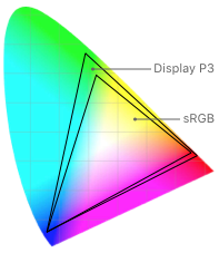
A color space represents the colors in a color model like RGB or CMYK. Common color spaces — sometimes called gamuts — are sRGB and Display P3.
A color profile describes the colors in a color space using, for example, mathematical formulas or tables of data that map colors to numerical representations. An image embeds its color profile so that a device can interpret the image’s colors correctly and reproduce them on a display.
Apply color profiles to your images. Color profiles help ensure that your app’s colors appear as intended on different displays. The sRGB color space produces accurate colors on most displays.
Use wide color to enhance the visual experience on compatible displays. Wide color displays support a P3 color space, which can produce richer, more saturated colors than sRGB. As a result, photos and videos that use wide color are more lifelike, and visual data and status indicators that use wide color can be more meaningful. When appropriate, use the Display P3 color profile at 16 bits per pixel (per channel) and export images in PNG format. Note that you need to use a wide color display to design wide color images and select P3 colors.
Provide color space–specific image and color variations if necessary. In general, P3 colors and images appear fine on sRGB displays. Occasionally, it may be hard to distinguish two very similar P3 colors when viewing them on an sRGB display. Gradients that use P3 colors can also sometimes appear clipped on sRGB displays. To avoid these issues and to ensure visual fidelity on both wide color and sRGB displays, you can use the asset catalog of your Xcode project to provide different versions of images and colors for each color space.
To learn more, see How to start designing assets in Display P3.
Platform considerations
iOS, iPadOS
iOS defines two sets of dynamic background colors — system and grouped — each of which contains primary, secondary, and tertiary variants that help you convey a hierarchy of information. In general, use the grouped background colors (systemGroupedBackground, secondarySystemGroupedBackground, and tertiarySystemGroupedBackground) when you have a grouped table view; otherwise, use the system set of background colors (systemBackground, secondarySystemBackground, and tertiarySystemBackground).
With both sets of background colors, you generally use the variants to indicate hierarchy in the following ways:
- Primary for the overall view
- Secondary for grouping content or elements within the overall view
- Tertiary for grouping content or elements within secondary elements
For foreground content, iOS defines the following dynamic colors:
| Color | Use for... | UIKit API |
|---|---|---|
| Label | A text label that contains primary content. | label |
| Secondary label | A text label that contains secondary content. | secondaryLabel |
| Tertiary label | A text label that contains tertiary content. | tertiaryLabel |
| Quaternary label | A text label that contains quaternary content. | quaternaryLabel |
| Placeholder text | Placeholder text in controls or text views. | placeholderText |
| Separator | A separator that allows some underlying content to be visible. | separator |
| Opaque separator | A separator that doesn’t allow any underlying content to be visible. | opaqueSeparator |
| Link | Text that functions as a link. | link |
macOS
macOS defines the following dynamic system colors (you can also view them in the Developer palette of the standard Color panel):
| Color | Use for... | AppKit API |
|---|---|---|
| Alternate selected control text color | The text on a selected surface in a list or table. | alternateSelectedControlTextColor |
| Alternating content background colors | The backgrounds of alternating rows or columns in a list, table, or collection view. | alternatingContentBackgroundColors |
| Control accent | The accent color selected by the user in System Settings. | controlAccent |
| Control background color | The background of a large interface element, such as a browser or table. | controlBackgroundColor |
| Control color | The surface of a control. | controlColor |
| Control text color | The text of a control that is enabled. | controlTextColor |
| Current control tint | The system-defined control tint. | currentControlTint |
| Disabled control text color | The text of a control that’s disabled. | disabledControlTextColor |
| Find highlight color | The color of a find indicator. | findHighlightColor |
| Grid color | The gridlines of an interface element, such as a table. | gridColor |
| Header text color | The text of a header cell in a table. | headerTextColor |
| Highlight color | The virtual light source onscreen. | highlightColor |
| Keyboard focus indicator color | The ring that appears around the currently focused control when using the keyboard for interface navigation. | keyboardFocusIndicatorColor |
| Label color | The text of a label containing primary content. | labelColor |
| Link color | A link to other content. | linkColor |
| Placeholder text color | A placeholder string in a control or text view. | placeholderTextColor |
| Quaternary label color | The text of a label of lesser importance than a tertiary label, such as watermark text. | quaternaryLabelColor |
| Scrubber textured background color | The background of a scrubber in the Touch Bar. For guidance, see Touch Bar > Visual Design > Color. | scrubberTexturedBackgroundColor |
| Secondary label color | The text of a label of lesser importance than a primary label, such as a label used to represent a subheading or additional information. | secondaryLabelColor |
| Selected content background color | The background for selected content in a key window or view. | selectedContentBackgroundColor |
| Selected control color | The surface of a selected control. | selectedControlColor |
| Selected control text color | The text of a selected control. | selectedControlTextColor |
| Selected menu item text color | The text of a selected menu. | selectedMenuItemTextColor |
| Selected text background color | The background of selected text. | selectedTextBackgroundColor |
| Selected text color | The color for selected text. | selectedTextColor |
| Separator color | A separator between different sections of content. | separatorColor |
| Shadow color | The virtual shadow cast by a raised object onscreen. | shadowColor |
| Tertiary label color | The text of a label of lesser importance than a secondary label, such as a label used to represent disabled text. | tertiaryLabelColor |
| Text background color | The background color behind text. | textBackgroundColor |
| Text color | The text in a document. | textColor |
| Under page background color | The background behind a document’s content. | underPageBackgroundColor |
| Unemphasized selected content background color | The selected content in a non-key window or view. | unemphasizedSelectedContentBackgroundColor |
| Unemphasized selected text background color | A background for selected text in a non-key window or view. | unemphasizedSelectedTextBackgroundColor |
| Unemphasized selected text color | Selected text in a non-key window or view. | unemphasizedSelectedTextColor |
| Window background color | The background of a window. | windowBackgroundColor |
| Window frame text color | The text in the window’s title bar area. | windowFrameTextColor |
App accent colors
Beginning in macOS 11, you can specify an accent color to customize the appearance of your app’s buttons, selection highlighting, and sidebar icons. The system applies your accent color when the current value in General > Accent color settings is multicolor.
If people set their accent color setting to a value other than multicolor, the system applies their chosen color to the relevant items throughout your app, replacing your accent color. The exception is a sidebar icon that uses a fixed color you specify. Because a fixed-color sidebar icon uses a specific color to provide meaning, the system doesn’t override its color when people change the value of accent color settings. For guidance, see Sidebars.
The iCloud glyph remains teal, even when the other glyphs use orange.
tvOS
Consider choosing a limited color palette that coordinates with your app logo. Subtle use of color can help you communicate your brand while deferring to the content.
Avoid using only color to indicate focus. Subtle scaling and responsive animation are the primary ways to denote interactivity when an element is in focus.
watchOS
Use pure black for your app’s background color. Pure black — that is, #000000 hex — blends seamlessly with the Apple Watch bezel and creates the illusion of an edgeless screen.
Recognize that people might prefer graphic complications to use tinted mode instead of full color. The system can use a single color that’s based on the wearer’s selected color in a graphic complication’s images, gauges, and text. For guidance, see Complications.
Specifications
iOS, iPadOS
System colors (iOS)
System gray colors (iOS)
macOS
System colors (macOS)
watchOS
System colors (watchOS)
| Values | Name | SwiftUI API |
|---|---|---|
|
R 255
G 59
B 48
|
Red | systemRed |
|
R 255
G 149
B 0
|
Orange | systemOrange |
|
R 255
G 230
B 32
|
Yellow | systemYellow |
|
R 4
G 222
B 113
|
Green | systemGreen |
|
R 102
G 212
B 207
|
Mint | systemMint |
|
R 106
G 196
B 220
|
Teal | systemTeal |
|
R 90
G 200
B 250
|
Cyan | systemCyan |
|
R 32
G 148
B 250
|
Blue | systemBlue |
|
R 120
G 122
B 255
|
Indigo | systemIndigo |
|
R 191
G 90
B 242
|
Purple | systemPurple |
|
R 250
G 17
B 79
|
Pink | systemPink |
|
R 172
G 142
B 104
|
Brown | systemBrown |
|
R 155
G 160
B 170
|
Gray | systemGray |

