Apple Pencil and Scribble
Apple Pencil helps make drawing, handwriting, and marking effortless and natural, in addition to performing well as a pointer and UI interaction tool.


Apple Pencil is a versatile, intuitive tool for iPad apps that offers pixel‑level precision when jotting notes, sketching, painting, marking up documents, and more. Scribble lets people use Apple Pencil to enter text in any text field through fast, private, on-device handwriting recognition.
Best practices
Support behaviors people intuitively expect when using a marking instrument. Most people have a lot of experience with real-world marking tools, and this knowledge informs their expectations when they use Apple Pencil with your app. To provide a delightful experience, think about the ways people interact with nondigital pencils, pens, and other marking instruments, and proactively support actions that people may naturally attempt. For example, people often want to write in the margins of documents or books.
Let people choose when to switch between Apple Pencil and finger input. For example, if your app supports Apple Pencil for marking, also ensure that your app’s controls respond to Apple Pencil so people don’t have to switch to using their finger to activate them. In this scenario, a control that doesn’t support Apple Pencil input might seem to be unresponsive, giving the impression of a malfunction or low battery. (Scribble only supports Apple Pencil input.)
Let people make a mark the moment Apple Pencil touches the screen. You want the experience of putting Apple Pencil to screen to mirror the experience of putting a classic pencil to paper, so it's essential to avoid requiring people to tap a button or enter a special mode before they can make a mark.
Help people express themselves by responding to the way they use Apple Pencil. Apple Pencil can sense tilt (altitude), force (pressure), and orientation (azimuth). Use this information to affect the strokes Apple Pencil makes, such as by varying thickness and intensity. When responding to pressure, keep things simple and intuitive. For example, it feels natural to affect continuous properties — such as ink opacity or brush size — by varying the pressure.

Altitude

Pressure

Azimuth
Provide visual feedback to indicate a direct connection with content. Make sure Apple Pencil appears to directly and immediately manipulate content it touches onscreen. Avoid letting Apple Pencil appear to initiate seemingly disconnected actions, or affect content on other parts of the screen.
Design a great left- and right-handed experience. Avoid placing controls in locations that may be obscured by either hand. If there’s a chance controls may become obscured, consider letting people reposition them.


Hover
With iPadOS 16 or later running on iPad Pro 11-inch (4th generation) or iPad Pro 12.9-inch (6th generation), the system can detect Apple Pencil (2nd generation) when it hovers up to 12 mm above the display.
Use hover to help people predict what will happen when Apple Pencil touches the screen. For example, as people hold Apple Pencil above the screen, a hover preview can show the dimensions and color of the mark that the current tool can make. As much as possible, avoid continuously modifying the preview as people move Apple Pencil closer or farther from the screen. A preview that changes according to height is unlikely to clarify the mark Apple Pencil will make, and frequent visual variations can be very distracting to people.
Avoid using hover to initiate an action. Unlike tapping a button or marking the screen, hovering is a relatively imprecise motion that doesn’t require people to think about the actual distance between Apple Pencil and the display. You don’t want people to inadvertently perform an action — especially a destructive action that they might want to undo — just because they hold Apple Pencil near the screen.
Prefer showing a preview value that’s near the middle in a range of dynamic values. Dynamic properties like opacity or flow can be difficult to depict at the highest or lowest ends of the spectrum. For example, previewing the appearance of a brush mark made with the maximum pressure could occlude the area in which people are marking; in contrast, depicting a mark made with the minimum pressure could be hard for people to detect, making the preview an inaccurate representation of an actual mark or even invisible.
Consider using hover to enable relevant interactions close to where people are marking. For example, you might use hover to display a contextual menu of tool sizes when people hold Apple Pencil above the screen and either double-tap it or press a modifier key on an attached keyboard. Revealing a menu near where people are marking lets them make choices without moving Apple Pencil or their hands to another part of the screen.
Prefer showing hover previews for Apple Pencil, not for a pointing device. Although a pointing device can also respond to hover gestures, it might be confusing to provide the same visual feedback for both devices. If it makes sense in your app, you can restrict your hover preview to Apple Pencil only. For developer guidance, see Adopting hover support for Apple Pencil.
Double tap
Respect people’s settings for the double-tap gesture when they make sense in your app. By default, Apple Pencil (2nd generation) responds to the double-tap gesture by toggling between the current tool and the eraser, but people can set the gesture to toggle between the current and previous tool, show and hide the color picker, or do nothing at all. If your app supports these behaviors, let people use their preferred gestures to enable them. If the systemwide double-tap settings don’t make sense in your app, you can still use the gesture to change the mode of Apple Pencil (2nd generation). For example, a 3D app that offers a mesh-editing tool could use double-tap to toggle between the tool’s raise and lower modes.
Give people a way to enable custom double-tap behavior if necessary. If you offer custom double-tap behavior in addition to some or all of the default behaviors, provide a control that lets people choose the custom behavior mode. People need to know which mode they’re in; otherwise, they may get confused when your app responds differently to their interactions. In this scenario, make sure it’s easy for people to discover the custom behavior your app supports, but don’t enable it by default.
Avoid using the double-tap gesture to perform an action that modifies content. It’s possible for people to double-tap accidentally, which means that they may not even be aware that your app has performed the action. Prefer using double-tap to enable actions that are easy for people to undo. In particular, avoid using double-tap to perform a potentially destructive action that might result in data loss.
Scribble
With Scribble and Apple Pencil, people can simply write wherever text is accepted in your app — they don’t have to tap or switch modes first. Because Scribble is fully integrated into iPadOS 14 and later, it’s available to all apps by default.
Make text entry feel fluid and effortless. By default, Scribble works in all standard text components — such as text fields, text views, search fields, and editable fields in web content — except password fields. If you use a custom text field in your app, avoid making people tap or select it before they can begin writing.
Make Scribble available everywhere people might want to enter text. Unlike using the keyboard, using Apple Pencil encourages people to treat the screen the way they treat a sheet of paper. Help strengthen this perception in your app by making Scribble consistently available in places where text entry seems natural. For example, in Reminders, it’s natural for people to create a new reminder by writing it in the blank space below the last item, even though the area doesn’t contain a text field. For developer guidance, see UIIndirectScribbleInteraction.
Avoid distracting people while they write. Some text field behaviors work well for keyboard input, but can disrupt the natural writing experience that Apple Pencil enables. For example, it’s best to avoid displaying autocompletion text as people write in a text field because the suggestions can visually interfere with their writing. It’s also a good idea to hide a field’s placeholder text the moment people begin to write so that their input doesn’t appear to overlap it.
While people are writing in a text field, make sure it remains stationary. In some cases, it can make sense to move a text field when it becomes focused: for example, a search field might move to make more room to display results. Such a movement is fine when people are using the keyboard, but when they’re writing it can make them feel like they’ve lost control of where their input is going. If you can’t prevent a text field from moving or resizing, consider delaying the change until people pause their writing.
Prevent autoscrolling text while people are writing and editing in a text field. When transcribed text autoscrolls, people might try to avoid writing on top of it. Worse, if text scrolls while people are using Apple Pencil to select it, they might select a different range of text than they want.
Give people enough space to write. A small text field can feel uncomfortable to write in. When you know that Apple Pencil input is likely, improve the writing experience in your app by increasing the size of the text field before people begin to write in it or when they pause writing; avoid resizing a text field while people are writing. For developer guidance, see UIScribbleInteraction.
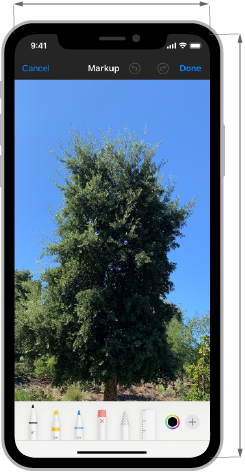
Custom drawing
Using PencilKit, you can let people take notes, annotate documents and images, and draw with the same low-latency experience that iOS provides. PencilKit also makes it easy to create a custom drawing canvas in your app and offer a state-of-the-art tool picker and ink palette.
Help people draw on top of existing content. By default, the colors on your PencilKit canvas dynamically adjust to Dark Mode, so people can create content in either mode and the results will look great in both. However, when people draw on top of existing content like a PDF or a photo, you want to prevent the dynamic adjustment of colors so that the markup remains sharp and visible.
Make sure the tool picker doesn’t obscure content when your app runs in a compact environment. In a regular environment, the tool picker floats above the content so people can move it out of the way, but in a compact environment the tool picker stays pinned to the bottom edge of the screen. To avoid obscuring people’s content, you can adjust the content view’s frame or the scroll view insets to account for the height of the tool picker.

![]()
![]()
Consider displaying custom undo and redo buttons when your app runs in a compact environment. In a regular environment, the tool picker includes undo and redo buttons, but in a compact environment it doesn't. In a compact environment, you could display undo and redo buttons in a navigation bar or toolbar. You might also consider supporting the standard 3-finger undo/redo gesture, so people can use it in any environment. For guidance, see Undo and redo.
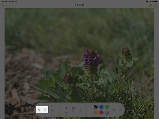
Regular environment
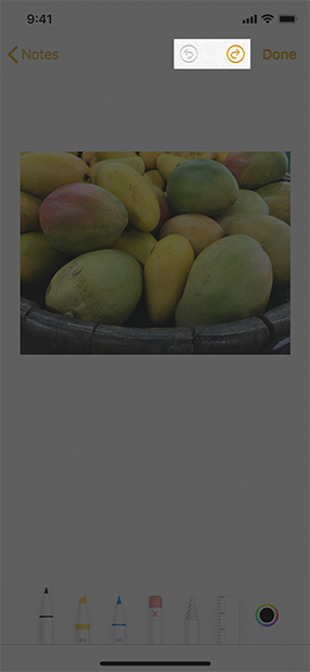
Compact environment
Platform considerations
Not supported in iOS, macOS, tvOS, or watchOS.


