Buttons and marks
The system provides several Apple Pay button types and styles you can use in your app or website. In contrast to the Apple Pay buttons, you use the Apple Pay mark to communicate the availability of Apple Pay as a payment option.
Don’t create your own Apple Pay button design or attempt to mimic the system-provided button designs.
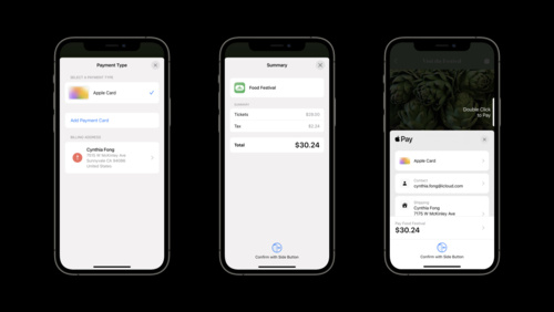
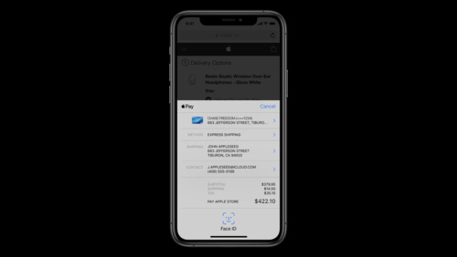
For related design guidance, see Offering Apple Pay and Checkout and payment. For developer guidance, see PKPaymentButtonType and PKPaymentButtonStyle (iOS and macOS), WKInterfacePaymentButton (watchOS), and Apple Pay on the web (web).
Button types
Apple provides several types of buttons so that you can choose the button type that fits best with the terminology and flow of your purchase or payment experience.
Use the Apple-provided APIs to create Apple Pay buttons. When you use the system-provided APIs, you get:
- A button that is guaranteed to use an Apple-approved caption, font, color, and style
- Assurance that the button’s contents maintain ideal proportions as you change its size
- Automatic translation of the button’s caption into the language that’s set for the device
- Support for configuring the button’s corner radius to match the style of your UI
- A system-provided alternative text label that lets VoiceOver describe the button
| Payment button type | Example usage |
|---|---|
 |
An area in an app or website where people can make a purchase, such as a product detail page or shopping cart page. |
 |
An app or website that lets people pay bills or invoices, such as those for a utility — like cable or electricity — or a service — like plumbing or car repair. |
 |
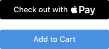
An app or website offering a shopping cart or purchase experience that includes other payment buttons that start with the text Check out. |
 |
An app or website offering a shopping cart or purchase experience that includes other payment buttons that start with the text Continue with. |
 |
An app or website that helps people book flights, trips, or other experiences. |
 |
An app or website for an approved nonprofit that lets people make donations. |
 |
An app or website that lets people purchase a subscription, such as a gym membership or a meal-kit delivery service. |
 |
An app or website that uses the term reload to help people add money to a card, account, or payment system associated with a service, such as transit or a prepaid phone plan. |
 |
An app or website that uses the term add money to help people add money to a card, account, or payment system associated with a service, such as transit or a prepaid phone plan. |
 |
An app or website that uses the term top up to help people add money to a card, account, or payment system associated with a service, such as transit or a prepaid phone plan. |
 |
An app or website that lets people place orders for items like meals or flowers. |
 |
An app or website that lets people rent items like cars or scooters. |
 |
An app or website that uses the term support to help people give money to projects, causes, organizations, and other entities. |
 |
An app or website that uses the term contribute to help people give money to projects, causes, organizations, and other entities. |
 |
An app or website that lets people tip for goods or services. |
 |
An app or website that has stylistic reasons to use a button that can have a smaller minimum width or that doesn’t specify a call to action. If you choose a payment button type that isn’t supported on the version of the operating system your app or website is running in, the system may replace it with this button. |
When a device supports Apple Pay, but it hasn’t been set up yet, you can use the Set up Apple Pay button to show that Apple Pay is accepted and to give people an explicit opportunity to set it up.

You can display the Set up Apple Pay button on pages such as a Settings page, a user profile screen, or an interstitial page. Tapping the button in any of these locations should initiate the process of adding a card.
Button styles
Beginning in iOS 14 and macOS 11, you can use the automatic style to let the current system appearance determine the appearance of the Apple Pay buttons in your app (for developer guidance, see PKPaymentButtonStyle.automatic). If you want to control the button appearance yourself, you can use one of the following options. For web developer guidance, see ApplePayButtonStyle.
Black
Use on white or light-color backgrounds that provide sufficient contrast. Don’t use on black or dark backgrounds.


White with outline
Use on white or light-color backgrounds that don’t provide sufficient contrast. Don’t place on dark or saturated backgrounds.


White
Use on dark-color backgrounds that provide sufficient contrast.


Button size and position
Prominently display the Apple Pay button. Make the Apple Pay button no smaller than other payment buttons, and avoid making people scroll to see it.

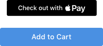
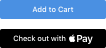
Position the Apple Pay button correctly in relation to an Add to Cart button. In a side-by-side layout, place the Apple Pay button to the right of an Add to Cart button.


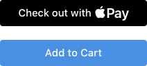
In a stacked layout, place the Apple Pay button above an Add to Cart button.
Adjust the corner radius to match the appearance of other buttons. By default, an Apple Pay button has rounded corners. You can change the corner radius to produce a button with square corners or a pill-shaped button. For developer guidance, see cornerRadius.

Minimum corner radius
Default corner radius
Maximum corner radius
Maintain the minimum button size and margins around the button. Be mindful that the button title may vary in length depending on the locale.
NOTE If the size you specify doesn’t accommodate the translated title for the type of payment button you’re using, the system automatically replaces it with the plain Apple Pay button shown below on the left. There is no automatic replacement for the Set up Apple Pay button.
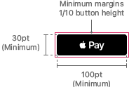
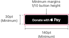
Use the following values for guidance.
| Button | Minimum width | Minimum height | Minimum margins |
|---|---|---|---|
| Apple Pay | 100pt (100px @1x, 200px @2x) | 30pt (30px @1x, 60px @2x) | 1/10 of the button’s height |
| Book with Apple Pay Buy with Apple Pay Check out with Apple Pay Donate with Apple Pay Set up Apple Pay Subscribe with Apple Pay |
140pt (140px @1x, 280px @2x) | 30pt (30px @1x, 60px @2x) | 1/10 of the button’s height |
Apple Pay mark
Use the Apple Pay mark graphic to show that Apple Pay is an available payment option when showing other payment options in a similar manner. The Apple Pay mark is not a button; if you need an Apple Pay button, choose one of the buttons described in Button types. For design guidance related to showing Apple Pay as a payment option, see Offering Apple Pay.
Use only the artwork provided by Apple, with no alterations other than height. You can specify a height for the Apple Pay mark, but make sure that the height you use is equal to or larger than other payment brand marks in your payment flow. Don’t adjust the width, corner radius, or aspect ratio of the artwork; don’t add a trademark symbol or any other content; don’t remove the border; don’t add visual effects to the mark, such as shadows, glows, or reflections; and don’t flip, rotate, or animate the Apple Pay mark.
Maintain a minimum clear space around the mark of 1/10 of its height. Don’t let the Apple Pay mark share its surrounding border with another graphic or button.
Download the Apple Pay mark graphic and full usage guidelines here.