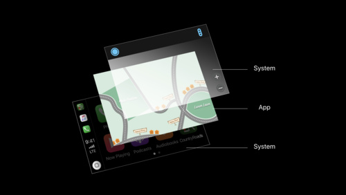
Architecture
Badging
Apps can display a small red oval containing a white number on their app icon to indicate when new and important information is available.
Make badging intuitive. People should know why your app icon is badged and how to find the related information when they open your app.
Minimize badging. Don’t overwhelm users by connecting badging with a huge amount of information that changes frequently. Use it to present brief, essential information and atypical content changes that are highly likely to be of interest.
Draw attention to important information inside your app too. If you rely solely on app icon badging to highlight information, you run the risk of people missing it. Displaying badges on a tab bar or elsewhere within your app is another way to direct users to important content.
Avoid supplementing badging with alerts. Even when new or important information is available, users don't want to see an alert the moment they open your app. Instead, make the information discoverable. For related design guidance, see Error handling and Alerts.
Keep badges up to date. Update your app’s badge as soon as the corresponding information is viewed. You don’t want people to think new or important information is available, only to find that they’ve already seen it.
For developer guidance, see UserNotifications.
Error handling
Apps should handle errors gracefully and report them to the user only when absolutely necessary.
Report errors in CarPlay, not on the connected iPhone. If you must notify the user of a problem, do so clearly in CarPlay. Never direct the user to pick up their iPhone to read or resolve an error.
Prefer nonintrusive status messages over alerts. Alerts disrupt the user experience. List error messages inline with content instead of displaying them in alerts.
Loading
When content is loading, a blank or static screen can make it seem like your app is frozen, which may cause people to leave your app.
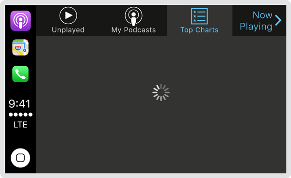
Make it clear when loading is occurring. Consider showing a spinning activity indicator and descriptive text. For related design guidance, see Activity indicators.
Show primary content as soon as it's available. Don’t make people wait for all content to load before seeing the screen they're expecting. Use placeholder text and graphics to identify additional content to come. Replace the placeholder elements as content loads. If possible, preload upcoming content in the background, for example, when the user is listening to audio or navigating a menu.
Navigation
In CarPlay, there are two main styles of navigation.
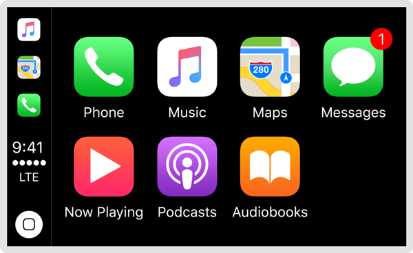
Flat navigation. Switch between multiple content categories, typically using a tab bar. The Phone app uses this navigation style.
Hierarchical navigation. Make one choice per screen until you reach a destination, typically using a navigation bar. To go to another destination, retrace your steps or start over from the beginning and make different choices. The Maps app uses this navigation style.

The Music app implements both flat and hierarchical navigation. At the top level, flat navigation enables switching between your library, your playlists, and radio. As you dive deeper, such as into the albums in your library, content is presented hierarchically.
Make it fast and easy to get to content. Structure information to require the least number of taps, swipes, and screens.
Restore the previous app state when the user returns to your app. Don't make someone retrace steps to reach their previous location in your app. Preserve and restore your app’s state so the user can continue where they left off. However, avoid resuming audio playback automatically unless it’s the primary feature of your app and is expected by the user.
In general, provide one path to each screen. People should always know where they are in your app and how to get to their next destination. Regardless of navigation style, it’s essential that the path through content is logical, predictable, and easy to follow.
When possible, use standard navigation components like tab bars and table views. Users are already familiar with these controls, and will intuitively know how to get around your app. Audio apps automatically adopt standard navigation controls. See Audio apps.
Use a navigation bar to traverse a hierarchy of data. The navigation bar’s title can show the current position in the hierarchy, and the back button makes it easy to return to the previous location. For specific guidance, see Navigation bars.
Use a tab bar to present peer categories of content or functionality. A tab bar lets people quickly and easily switch between categories, regardless of the current location. For specific guidance, see Tab bars.
Testing
Thorough testing is an essential part of designing and building any great app.
Test on an actual CarPlay-compatible display, preferably in a car. Make sure your app is easy to see and navigate from different driver positions, under different weather conditions, and at different times of day.
Test with poor network conditions such as while driving through a tunnel and in an area without cellular reception. Make sure your app handles connection losses and a lack of data gracefully and nonintrusively.
Test installation and setup. Install your app on a physical iPhone. Pay close attention to any sign-in requirements and privacy dialogs, and make sure your app appears as expected in CarPlay.