Tech Talks
-
-
 24:00
24:00
Get started with TestFlight
Discover how you can use TestFlight to improve your app experience and ready it for release on the App Store. We'll take you through an overview of TestFlight, including how to invite testers and provide information to them about testing. We'll also provide best practices for receiving feedback...
English, Japanese, Korean, Simplified Chinese -
 22:04
22:04
Explore Family Sharing for in-app purchases
Family Sharing for in-app purchases lets people share their auto-renewable subscriptions and non-consumables with up to five additional family members, helping you attract new subscribers, increase user engagement, and improve retention. We'll review how you can enable this feature in App Store...
English, Japanese, Korean, Simplified Chinese -
 23:05
23:05
Get started with in-app events
Discover how you can highlight your app or game's content on the App Store. We'll take you through the in-app events feature and provide recommendations, tips, and best practices for helping people discover content and events within your app.
English, Japanese, Korean, Simplified Chinese -
 2:34
2:34
What can you do on an Apple silicon Mac?
Learn how developers updated their apps for Apple silicon Macs and began taking advantage of the advanced capabilities of the Apple M1 chip.
English
-
-
App Services -
 22:48
22:48
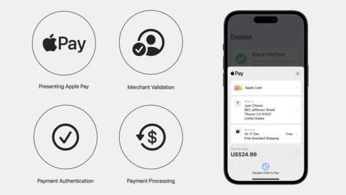
Get started with Apple Pay on the Web
Adding Apple Pay to your website elevates your customer experience. Learn how to present Apple Pay as a payment option, validate your merchant session, and authenticate and process payments. You'll also find out how to configure your environment, set up transactions using the Apple Pay demo site,...
App Services -
 17:24
17:24
Implement Apple Pay and order management
Apple Pay provides an easy and secure way for people to make payments in your iOS, iPadOS, and watchOS apps as well as on the web. We'll take you through the entire Apple Pay implementation workflow – including how you can signal support for Apple Pay, request payment and handling updates, and...
App Services English, Japanese, Korean, Simplified Chinese -
 17:20
17:20
Migrate custom intents to App Intents
Learn how you can easily convert your existing custom intents to App Intents. We'll take you through the conversion of your intents to Swift and discuss how you can improve discoverability of your app features when you create App Shortcuts. To learn more about App Intents, watch "Implement App...
App Services English, Japanese, Korean, Simplified Chinese -
 39:29
39:29
Integrate SiriKit Media Intents with HomePod
Bring your music service to HomePod and help users enjoy your content hands-free throughout their home. Discover how to build a great integration from start to finish. We'll take you through how Media Intents work, configuring your app as a preferred music service on HomePod and integrating...
App Services -
 6:35
6:35
What's New in Sharing
The Share Sheet provides a convenient way to share information from your current context with other apps, people, and services. Discover the details on using the Link Presentation framework to present shared URLs in a rich and consistent way, how to create a Share Extension configured to...
App Services English -
 11:53
11:53
Developing Complications for Apple Watch Series 4
Complications allow people to quickly glance and stay connected with your app on the watch face throughout their day. The new Infograph and Infograph Modular watch faces on Apple Watch Series 4 allow all new ways to create engaging, full-color complications. Learn about the new complication...
App Services English, Simplified Chinese -
 6:12
6:12
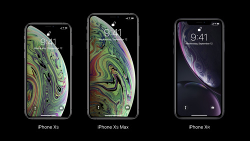
What's New in Core NFC
Background reading of NFC tags is a new feature for iPhone XS, iPhone XS Max, and iPhone XR. Learn how to associate your app with an NFC tag to make it even easier for people to benefit from the NFC capabilities of new iPhones.
App Services English, Simplified Chinese
-
-
App Store Distribution & Marketing -
 31:58
31:58
Improve your subscriber retention with App Store features
Learn how to minimize churn and win back subscribers on the App Store. Explore App Store data, review different types of subscriber churn, discover tools you can use to enhance your retention efforts, and learn implementation best practices.
App Store Distribution & Marketing -
 20:18
20:18
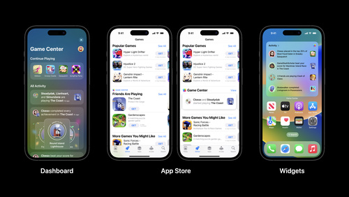
Use Game Center to boost discovery and engagement
Explore how Game Center, Apple's social gaming network, helps players discover and engage with your game. Learn about Game Center and App Store features that can help you connect with new players and keep them coming back, as well as Apple technologies designed to deliver powerful gameplay...
App Store Distribution & Marketing English -
 20:11
20:11
Measure and improve acquisition with App Analytics
Learn how App Analytics can help you better understand user acquisition, so you can make data‑informed decisions. Explore ways to find out where your users are coming from and review definitions of key metrics. We'll also discuss how peer group benchmarks and other features can help improve your...
App Store Distribution & Marketing English -
 28:55
28:55
Explore App Store pricing upgrades
Learn about the newest pricing capabilities available on the App Store. We'll walk through enhanced global pricing, new tools to manage pricing by storefront, additional price points, and global equalization. We'll also share configuration examples.
App Store Distribution & Marketing English, Japanese, Simplified Chinese -
 10:37
10:37
Write clear purpose strings
Learn how to write clear and succinct purpose strings to help people understand why your app needs access to protected resources like their camera, location, and health data. We'll take you through best practices to help craft concise purpose strings and show you how you can improve wording in...
App Store Distribution & Marketing English, Japanese, Korean, Simplified Chinese -
 11:17
11:17
Manage auto-renewable subscription pricing in App Store Connect
Discover how you can use App Store Connect to manage prices for your auto-renewable subscriptions. We'll provide guidance to help you plan subscription price increases and decreases, show you how to remove preserved pricing, and explore how to edit upcoming price changes.
App Store Distribution & Marketing English -
 15:21
15:21
Explore unlisted app distribution
Discover a new way you can distribute apps to limited audiences on the App Store. We'll take you through the differences between using unlisted distribution and standard distribution on the App Store, show you how to share apps with a direct link, and more.
App Store Distribution & Marketing English -
 28:10
28:10
Get started with product page optimization
Help make your App Store product page even more relevant and effective with product page optimization. We'll explore details of the feature, take you through the setup process in App Store Connect including how to test different app icons, screenshots and app previews, and share testing...
App Store Distribution & Marketing English, Japanese, Simplified Chinese -
 19:43
19:43
Get started with custom product pages
Learn how you can create additional versions of your App Store product page and showcase different features or content within your app. We'll explore how you can create pages for a specific aspect of your app or a specific audience, show you how to set it up in App Store Connect, and highlight...
App Store Distribution & Marketing English, Japanese, Simplified Chinese -
 12:34
12:34
Tips for preventing common review issues
Prepare your app for review with these tips from the App Review team. Learn how to prevent the most common issues and discover best practices for an easy and straightforward review experience.
App Store Distribution & Marketing English, Japanese, Simplified Chinese -
 40:25
40:25
Deploy macOS Big Sur in your organization
Discover the latest on the platform changes in macOS Big Sur and Mac computers with the Apple M1 chip, including features available in macOS Big Sur 11.3. Learn about macOS Big Sur management capabilities and strategies for deploying in business and education. Hear about changes to deployment...
App Store Distribution & Marketing -
 29:12
29:12
Subscription offer codes
Subscription offer codes can help you acquire, retain, and win back subscribers as you grow your business. Learn about configuration options, creating a great experience, and measuring redemptions. We'll explore how to set up customer eligibility, territory, price, and expiration in App Store...
App Store Distribution & Marketing -
 9:12
9:12
Designing for Subscription Success
Providing a great subscription experience within your app makes it easier to acquire new subscribers. Learn how to more clearly communicate the value of your subscriptions, streamline your sign up flow, and make subscriptions appealing and effortless.
App Store Distribution & Marketing English, Simplified Chinese
-
-
Audio & Video -
 12:50
12:50
Discover Reference Mode
Learn how you can match color requirements in demanding pro workflows using Reference Mode on the 12.9-inch iPad Pro with Liquid Retina XDR display. We'll show you how Reference Mode enables you to represent color accurately and provide consistent image representation in workflows like review and...
Audio & Video English -
 27:24
27:24
Support Apple Pro Display XDR in your apps
Apple Pro Display XDR is a high grade reference monitor designed for professional workflows such as video editing, photography, 3D animation and game development. Discover how you can use underlying technology and framework-level support to improve your professional workflows for content...
Audio & Video English, Japanese, Simplified Chinese -
 5:55
5:55
Apple TV App and Universal Search Video Integration - Part 2
Get an overview of the client-side integration required for 3rd party applications that are participating with the Apple TV App. Learn about onboarding and testing. See how to register subscriptions for your customers, report playback data as content is watched in your applications, and support...
Audio & Video English -
 15:21
15:21
Apple TV App and Universal Search Video Integration - Part 1
This video provides a feature overview of the Apple TV App and Universal Search services, and introduces how 3rd party video services integrate with them through metadata feeds. Requirements for providing metadata about your movies, tv shows, and sporting events are detailed — in addition how to...
Audio & Video English -
 2:01
2:01
Apple TV VSA Framework
Learn about the VideoSubscriberAccount framework, what it does, and how to integrate this framework with your app. Learn how this framework fits into the development for the Apple TV Distribution Program.
Audio & Video English -
 3:07
3:07
Apple TV Set Top Box APIs
Learn about the Set Top Box APIs, what they do, and how they help make the Apple TV setup easier for your customers. Learn how this framework fits into the development for the Apple TV Distribution Program.
Audio & Video English -
 5:27
5:27
Apple TV Authentication Context
Learn about the Apple TV authentication context, what it does, and how to start building this web service. Learn how the authentication context fits into the development for the Apple TV Distribution Program.
Audio & Video English -
 4:09
4:09
Apple TV Distribution Program Overview
Learn about the Apple TV Distribution Program and the engineering requirements and business benefits that come with enrollment. Familiarize yourself with the authentication context, VideoSubscriberAccount framework, and the Set Top Box APIs.
Audio & Video English -
 6:20
6:20
Introduction to AVDisplayManager
Starting with tvOS 11.2, Apple TV 4K can automatically switch video display modes to match the native frame rate and dynamic range of video content. With tvOS 11.3, Apple TV (4th generation) can also automatically switch video display modes to match native frame rate. Learn how to make sure your...
Audio & Video English -
 6:38
6:38
An Introduction to HDR Video
Dolby Vision and HDR10 enable amazing new video viewing experiences with a wider color gamut and deeper contrast. Learn how this new technology works, and what the differences are between Dolby Vision and HDR10.
Audio & Video English, Simplified Chinese -
 3:45
3:45
Authoring 4K and HDR HLS Streams
4K and HDR technologies enable the creation of amazing cinematic video experiences and stunning picture quality. Learn about how to support these new formats, and how to properly author your playlists to enable playback of these types of streams.
Audio & Video English, Simplified Chinese -
 12:50
12:50
Designing for iPhone X
iPhone X features an all-screen Super Retina display, providing more space to display content and create deeply immersive experiences. Learn how to design your app or game to look and feel great on iPhone X, and all iOS devices.
Audio & Video English, Simplified Chinese
-
-
Business & Education -
 16:53
16:53
Make the most of custom product pages
Discover how you can maximize the effectiveness of your custom product pages on the App Store. We'll cover best practices, provide data-based recommendations, and share success stories from developers who have used custom product pages to reach specific audiences.
Business & Education English, Japanese, Korean, Simplified Chinese -
 22:23
22:23
Get started with app discovery and marketing
Learn how you can improve the discovery of your app on the App Store. We'll explore the different ways people find apps on the App Store and show you how to make your own app more discoverable. Discover the elements of a great product page, the role of search, referral traffic, and promotional...
Business & Education English, Japanese, Korean, Simplified Chinese -
 18:46
18:46
Make the most of product page optimization
Learn how to get more from your product page optimization tests. We'll explore best practices, provide data-based recommendations, and share success stories from developers who have used product page optimization to make their App Store product pages even more relevant and effective.
Business & Education English, Japanese, Korean, Simplified Chinese -
 35:11
35:11
What's new for enterprise developers
Discover how you can build compelling apps for your business on iOS, iPadOS, macOS, and watchOS. We'll take you through a curated overview of the latest updates to Apple platforms and explore relevant features that you can use to create engaging enterprise apps to transform workflows, inform...
Business & Education English, Japanese, Korean, Simplified Chinese -
 19:32
19:32
Optimize subscriptions for success: acquisition
Learn how you can acquire subscribers and grow your business using App Store features. We'll explore subscriber acquisition strategies, share implementation best practices, and show you how to integrate these processes into your app for success.
Business & Education English -
 17:01
17:01
Get started with custom offer codes
Discover how you can complement existing offer codes campaigns with custom, repeatable codes to provide even more flexibility to acquire and retain subscribers. We'll take you through the latest enhancements to offer codes, provide engineering guidance, explore best practices, and show you how to...
Business & Education English, Japanese, Simplified Chinese -
 32:00
32:00
Prepare your organization for macOS Monterey
Discover the latest platform changes for deploying macOS Monterey in your business or education organization. Learn about changes to initial enrollment, ongoing management, and return to service including managing software updates and the new Erase All Content and Settings feature for macOS.
Business & Education English, Japanese, Simplified Chinese -
 29:01
29:01
Deploy iOS 15 in your organization
Discover the latest platform changes for deploying iOS 15 and iPadOS 15 in your business or education organization. Learn about deploying both organization-owned and personally-owned iPhone and iPad devices. Explore fundamentals and new updates for deployment workflows including enrollment,...
Business & Education English, Japanese, Simplified Chinese -
 18:33
18:33
Introducing Extensible Enterprise SSO
Single Sign-on ensures your enterprise can implement modern authentication methods without sacrificing ease of use. Learn how to use the Authentication Services framework to expose your redirect and credential SSO services in Safari and native apps on macOS Catalina, iPadOS 13, and iOS 13...
Business & Education English
-
-
Design -
 15:11
15:11
Meet Apple Watch Series 7
Apple Watch Series 7 introduces new device sizes and a display that features a subtle wraparound effect. Learn how you can adapt your watchOS app design to look great on all screen sizes: We'll show you how to take advantage of a larger content area, create clearer hierarchy using color and...
Design English, Japanese, Simplified Chinese -
 9:26
9:26
Designing for Apple Watch Series 4
Apple Watch Series 4 provides new opportunities for designers and developers to do more with their apps. Series 4 watches have new displays with larger dimensions, and other enhancements that allow developers to deliver richer and more immersive experiences.
Design English, Simplified Chinese
-
-
Developer Tools -
 8:04
8:04
Connect your project to Xcode Cloud
Unlock the benefits of continuous integration and delivery in Xcode Cloud with source code management tools. Learn how to set up Xcode Cloud with a self-hosted source control management provider like GitHub Enterprise, troubleshoot common issues, and explore key project maintenance tips.
Developer Tools -
 11:56
11:56
Manage Game Center with the App Store Connect API
Discover how you can use the App Store Connect API to automate your Game Center configurations outside of App Store Connect on the web. Find out how the API can help you create achievements and leaderboards and share them between related games using groups. And learn how to enable and configure...
Developer Tools -
 6:44
6:44
Discover Metal Performance HUD
Get to know the new heads-up display panel built to help you analyze graphics performance in real time. Metal Performance HUD displays key graphics statistics so you can monitor, log, and identify tough-to-spot performance problems.
Developer Tools English, Japanese, Korean, Simplified Chinese -
 40:38
40:38
Support customers with StoreKit 2 and App Store Server API
Discover how you can use StoreKit 2, App Store Server API, and App Store Server Notifications to create great in-app purchase experiences for your customers and offer support and refunds. We'll explore implementation approaches, provide best practices and take you through customer management and...
Developer Tools English -
 23:31
23:31
Discover advances in Metal for A15 Bionic
Discover how you can elevate your apps and games with Metal and the A15 Bionic. We'll help you take advantage of Apple GPU family 8 with the latest Metal features: Learn how to save memory with Lossy Compression, dive into complex shadow mapping techniques with Sparse Depth and Stencil Textures,...
Developer Tools English -
 15:48
15:48
Improve Object Detection models in Create ML
When you train custom Core ML models for object detection in Create ML, you can bring image understanding to your app. Discover how transfer learning allows you to build smaller models with less training data. We'll also take you through some of the advanced parameters in Create ML that help you...
Developer Tools -
 11:22
11:22
Find and fix hitches in the commit phase
Discover how to render smoother animations in your app by troubleshooting the commit phase of your render loop. Dive into the mechanics of this phase, and learn how to use Instruments to uncover the source of hitches in your app, eliminate them, and avoid them outright.
Developer Tools -
 11:54
11:54
Explore UI animation hitches and the render loop
Explore how you can improve the performance of your app's user interface by identifying scrolling and animation hitches in your app. We'll take you through how hitches happen in the render loop, and explain how to measure hitch time ratio and fix the issues that most impact people using your app.
Developer Tools -
 19:24
19:24
Demystify and eliminate hitches in the render phase
When you implement complex view hierarchies in your app, you may run into animation hitches. Demystify how your views are turned into pixels during the render phase, and learn how to use Instruments to uncover issues in this part of the render loop. Discover how to eliminate offscreen passes and...
Developer Tools -
 28:57
28:57
Discover Metal enhancements for A14 Bionic
Explore how Metal is bringing sophisticated rendering and powerful compute features to A14 Bionic. We'll take you through the Metal capabilities delivered in the Apple GPU Family 7 feature set, including new texture addressing modes, fast SIMD reduction and matrix multiplication operations, and a...
Developer Tools -
 5:53
5:53
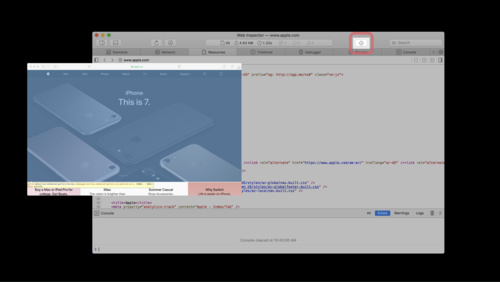
Web Inspector Walkthrough
Web Inspector is packed with features designed to make inspection, debugging and delivery of your web content a breeze. Get an overview of the latest features including major layouts, tabs, buttons, and other capabilities that make Web Inspector a powerful web development tool.
Developer Tools English -
 4:01
4:01
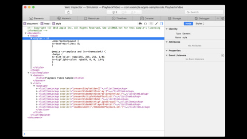
Using Web Inspector with tvOS Apps
With Web Inspector, you can debug web content on several Apple platforms, including tvOS. This video introduces you to Web Inspector's powerful debugging capabilities, and takes you through the features designed to accelerate debugging of TVML content in your tvOS app.
Developer Tools English
-
-
Graphics & Games -
 16:57
16:57
Bring your high-end game to iPhone 15 Pro
Discover how the power of A17 Pro can help you maximize your game on iPhone 15 Pro and iPhone 15 Pro Max. We'll share best practices and technical resources, and explore ways to optimize game performance, input, and asset management.
Graphics & Games English -
 26:00
26:00
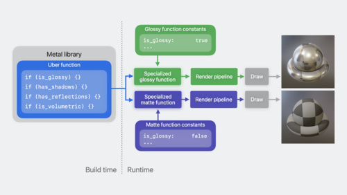
Learn performance best practices for Metal shaders
Discover how you can improve Metal shader performance using some of the latest advancements in Apple GPUs. Learn to reduce a shader's execution time by configuring function constants, and investigate ways to increase compiler optimization with function groups. Find out how to save run time by...
Graphics & Games -
 17:06
17:06
Meet rule-based matchmaking in Game Center
Learn how to incorporate the new rule-based matchmaking feature into your real-time multiplayer games. Discover how you can provide customized and flexible matchmaking to improve the quality of player matches and create a more fun and engaging experience for all players.
Graphics & Games -
 29:09
29:09
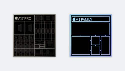
Explore GPU advancements in M3 and A17 Pro
Learn how Dynamic Caching, the next-generation shader core, hardware-accelerated ray tracing, and hardware-accelerated mesh shading of Apple family 9 GPUs can improve the performance of your Metal apps and games.
Graphics & Games -
 33:56
33:56
Discover new Metal profiling tools for M3 and A17 Pro
Learn how the new profiling tools in Xcode 15 can help you achieve the best Metal performance on Apple family 9 GPUs. Discover how to use shader cost graphs, performance heat maps, and shader execution history tools to profile and optimize your Metal code. Find out how to use new GPU counters to...
Graphics & Games -
 4:37
4:37
Add SharePlay to your multiplayer game with Game Center
Learn how to let your players jump into games with friends they're on FaceTime calls with, using SharePlay. We'll show you how easy it is to turn on SharePlay support if you are already using the Game Center multiplayer UI. And if you've built a custom interface, we'll give you the few lines of...
Graphics & Games English, Japanese, Korean, Simplified Chinese -
 35:07
35:07
Tune CPU job scheduling for Apple silicon games
Graphically-intensive games can be very demanding on hardware resources, requiring hundreds or even thousands of CPU jobs to be processed every frame. We'll show you how you can organize those jobs to maximize CPU efficiency and performance on the M1, M1 Pro, and M1 Max chips. Learn how you can...
Graphics & Games English, Japanese, Simplified Chinese -
 23:44
23:44
Metal Compute on MacBook Pro
Discover how you can take advantage of Metal compute on the latest MacBook Pro. Learn the fundamental principles of high-performance Metal compute and find out how you can take advantage of the framework to create better workflows for your development process and even better apps for creative pros.
Graphics & Games English -
 13:26
13:26
Explore Live GPU Profiling with Metal Counters
Take advantage of the Metal Counters API for GPU profiling in macOS Big Sur and iOS 14. This API provides access at runtime to low-level GPU profiling information, which was previously available only through offline tools in Xcode and Instruments. Metal Counters accelerate the optimization...
Graphics & Games English -
 35:48
35:48
Metal Enhancements for A13 Bionic
Metal brings powerful API features and GPU-driven capabilities to A13 Bionic including sparse textures, vertex amplification, Tier 2 argument buffers, ASTC HDR, and more. Understand the architectural improvements of the Apple-designed A13 Bionic and learn how the latest Metal enhancements advance...
Graphics & Games English -
 16:10
16:10
Metal 2 on A11 - Overview
The seamless integration of Metal 2 with the A11 Bionic chip lets your apps and games realize entirely new levels of performance and capability. Get introduced to powerful new API features and GPU-driven capabilities of Metal 2 on A11, including imageblocks, tile shading, enhancements to raster...
Graphics & Games English, Simplified Chinese -
 10:56
10:56
Metal 2 on A11 - Raster Order Groups
Raster order groups allow Metal 2 apps to precisely control the order of parallel fragment shader threads accessing the same pixel coordinates. Learn how A11 extends raster order groups with support for multiple groups and adds new capabilities for accessing threadgroup memory. See how you can...
Graphics & Games English, Simplified Chinese -
 13:16
13:16
Metal 2 on A11 - Imageblock Sample Coverage Control
Imageblock sample coverage control provides access to multisample tracking data within a tile shader, enabling development of custom MSAA resolve algorithms and more. Understand how the A11 GPU tracks unique samples, then explore an example that optimizes rendering of dense geometry through...
Graphics & Games English, Simplified Chinese -
 9:44
9:44
Metal 2 on A11 - Tile Shading
Tile shading is a new Metal 2 pipeline stage allowing apps to combine rendering and compute operations into a single render pass while sharing imageblock data and threadgroup memory. Understand how to create a tile shading pipeline, and see how it leverages the high-bandwidth tile memory of the...
Graphics & Games English, Simplified Chinese -
 10:28
10:28
Metal 2 on A11 - Imageblocks
Imageblocks enable Metal 2 apps to define and manipulate custom per-pixel data structures in the high-bandwidth tile memory of the A11 GPU. Learn how imageblocks can pass data between the fragment and tile stages of a render pass and unlock sophisticated rendering techniques such as approximate...
Graphics & Games English, Simplified Chinese
-
-
Health & Fitness -
 14:05
14:05
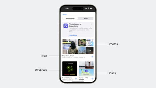
Discover the Journaling Suggestions API
Find out how the new Journaling Suggestions API can help people reflect on the small moments and big events in their lives though your app — all while protecting their privacy. Learn how to leverage the API to retrieve assets and metadata for journaling suggestions, invoke a picker on top of the...
Health & Fitness -
 12:22
12:22
Updating for Apple Watch Series 3
Apple Watch Series 3 makes it easier to stay connected, even when away from your phone. Learn how to keep your app responsive over cellular connections using URLSession. Find out how to optimize your Watch app networking code to ensure that your app is always up to date and ready for use...
Health & Fitness English, Simplified Chinese
-
-
ML & Vision -
 23:48
23:48
Explore and manipulate data in Swift with TabularData
Discover how you can use the TabularData framework to load, explore, and manipulate unstructured data in Swift — whether you need to pre-process data for a machine learning task or digest data on-the-fly in your app. Learn how this framework can help you handle large datasets, join multiple...
ML & Vision English -
 25:18
25:18
Convert PyTorch models to Core ML
Bring your PyTorch models to Core ML and discover how you can leverage on-device machine learning in your apps. The PyTorch machine learning framework can help you create and train complex neural networks. After you build these models, you can convert them to Core ML and run them entirely...
ML & Vision
-
-
Maps & Location -
 9:03
9:03
Meet high-performance MapKit JS
MapKit JS provides a JavaScript API to embed interactive Apple Maps directly into your webpages or apps across different platforms and operating systems, including iOS and Android. Learn about the latest features to help improve load performance and make your web and native apps more responsive...
Maps & Location English, Japanese, Korean, Simplified Chinese
-
-
Photos & Camera -
 9:16
9:16
QR Code Recognition on iOS 11
iOS 11 provides built-in support to detect and handle QR codes. Discover the supported QR code types, how each type is handled by built-in Camera and Safari apps, and how Universal Links can seamlessly send users to your app when scanning your QR codes.
Photos & Camera English
-
-
Privacy & Security -
 9:40
9:40
Do more with less data
Great apps do more for people while collecting less data. Learn how three simple tips from the App Review team can help you build great experiences while minimizing data collection.
Privacy & Security English, Japanese, Korean, Simplified Chinese -
 13:32
13:32
GDPR & CloudKit
The General Data Protection Regulation (GDPR) is a European Union regulation that requires developers to give users visibility and control over the personal data you store on their behalf. Learn how to use new and existing CloudKit APIs to build privacy into your apps and make sure customers can...
Privacy & Security English, Simplified Chinese
-
-
Safari & Web -
 24:57
24:57
Build and deploy Safari Extensions for iOS
Safari web extensions for iOS use standard web technologies to provide powerful browser customizations. Learn how you can build an extension that works for iPhone and iPad, and discover how you can publish your extension on the App Store.
Safari & Web English, Japanese, Simplified Chinese -
 5:31
5:31
Ensuring Beautiful Rich Links
Website links received in Messages can be made vastly more inviting than a simple text URL. By providing small amounts of metadata in your web pages, links to your website can include rich content such as icons, images and even video. Learn how visitors to your website can share links that look...
Safari & Web English
-
-
Spatial Computing -
 10:23
10:23
Advanced Scene Understanding in AR
ARKit 3.5 and RealityKit provide new capabilities that take full advantage of the LiDAR Scanner on the new iPad Pro. Check out ARKit 3.5 and learn about Scene Geometry, enhanced raycasting, instantaneous virtual object placement, and more. See how RealityKit takes advantage of these features to...
Spatial Computing English -
 7:25
7:25
Face Tracking with ARKit
ARKit and iPhone X enable a revolutionary capability for robust face tracking in AR apps. See how your app can detect the position, topology, and expression of the user's face, all with high accuracy and in real time. Learn about applying live selfie effects and see how to use facial expressions...
Spatial Computing English, Simplified Chinese
-
-
SwiftUI & UI Frameworks -
 8:47
8:47
Bringing Your Apps to the New iPad Pro
Take advantage of the all-screen design of the new iPad Pro by building your app with the iOS 12.1 SDK and making sure it appears correctly with the display's rounded corners and home indicator. Learn about the new common inset compatibility mode and what it means for apps running in multitasking...
SwiftUI & UI Frameworks English, Simplified Chinese -
 9:01
9:01
Building Apps for iPhone XS, iPhone XS Max, and iPhone XR
If your app has already adopted safe area insets, there's not much you will need to do to update your app for iPhone XS, iPhone XS Max, and iPhone XR. Learn how to set a collection view's section inset reference to the safe area with no code changes. Hear about an API change unique to iPhone XS...
SwiftUI & UI Frameworks English, Simplified Chinese -
 13:35
13:35
Building Apps for iPhone X
iPhone X has a beautiful new screen that will make your app look great. You may need to make some changes in your app to accommodate the new screen's size and rounded corners. Learn about some common pitfalls and see how you can take advantage of iOS 11's Safe Area and layout guides to make sure...
SwiftUI & UI Frameworks English, Simplified Chinese -
 2:49
2:49
Updating Your App for Apple TV 4K
Learn how to update your app for Apple TV 4K, including how to take advantage of new capabilities such as retina image support, HDR video, and the new motion capabilities of the Siri Remote.
SwiftUI & UI Frameworks English, Simplified Chinese
-
-
System Services -
 8:56
8:56
Adapt to changing network conditions
Apple devices can connect to multiple networks at the same time. Learn how your app can automatically select the best one for an optimal experience. Explore the different types of networks and review their characteristics. And discover how to use URLSession and Network framework to best describe...
System Services -
 10:27
10:27
Bring desktop class sync to iOS with FileProvider
Discover how you can sync files faster and more efficiently within your iPhone and iPad apps when you create a File Provider extension. Sync up with the File Provider team and learn how to build a modern File Provider for iOS. We'll show you how to architect your app to support seamless file...
System Services English -
 12:24
12:24
Get the most out of CloudKit Sharing
Discover how apps can use CloudKit to share records with others. We'll show you how to encourage collaboration between people using your app and support those interactions with Apple frameworks. Learn how to create and manage shares, explore sharing options like public permissions, and find out...
System Services English -
 24:26
24:26
Uniform Type Identifiers — a reintroduction
Ever wonder how the system decides what app should open a given file? Explore the Uniform Type Identifiers framework, which helps you simplify the process for supporting standard or proprietary file formats in your app. You'll learn how to use the new framework and Xcode to declare the types your...
System Services -
 8:53
8:53
iOS Storage Best Practices
Learn tips for keeping your app's on-disk storage as organized and optimized as possible. See how to enable direct access to documents in your app using the new Files app in iOS 11. Gain insights into how to take inventory of your app's files and make the most of the storage capacity available to...
System Services English, Simplified Chinese
-