Behind the Design: Headspace
June 5, 2023

Few apps have made mindfulness as accessible as Headspace.
More than a decade since its launch, the app continues to set the standard for mental health apps — an especially notable accomplishment, as it can be difficult to communicate challenging topics like mindfulness and mental health through an app. "Demystification is a word we use a lot,” says Jeff Birkeland, Headspace senior vice president and general manager for member products. “Mindfulness and mental health can seem complex, perhaps mystical, maybe even inaccessible. So how do we make it approachable and friendly? And how do we get people to the right content faster?”
The answer is an intentional mix of design, organization, and style. “I think the root of our success from the very beginning was creating a warm feel and brand,” he says.

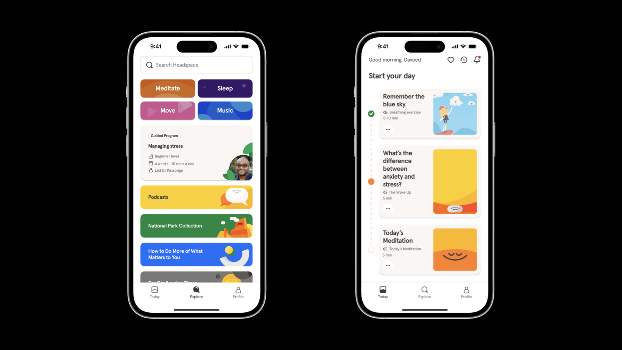
Headspace is easy to navigate, and its collections and activities are clearly labeled.
It’s hardly an overstatement to say that Headspace has been part of a tremendous social change regarding mental health. Birkeland says the app has been used by more than 100 million people in nearly 200 countries and regions, and it’s easy to see why. Headspace is an incredibly versatile tool for anyone looking for a quick clarity break, longer guided sessions, or help with sleep or exercise. And its huge library of resources is there whenever people need it.

Jeff Birkeland, Headspace
Headspace smartly organizes its library of resources through language. Collections and exercises are labeled with understandable purposes, like Unlocking Creativity, Mindful Eating, and The Shine Collection, a set of activities drawn from Headspace’s recent merger with Shine, a mindfulness app dedicated to providing inclusive and accessible mental health resources that support marginalized communities. “It’s still a simple app,” Birkeland says, “but it’s not a very long trip into an extensive archive.”
How do we make [mindfulness and mental health] approachable and friendly? And how do we get people to the right content faster?
Jeff Birkeland, Headspace senior vice president for member products
In previous versions of Headspace, the core navigation included tabs for meditation, focus, movement, and sleep. But Birkeland says user research convinced the team to strip away that complexity and focus instead on the app’s Today tab, which facilitates one-tap access to activities of varying lengths for morning, afternoon, and night. Importantly, it does so without bringing up specific categories.

Headspace’s illustration style and color scheme are part of the app’s mission to feel warm and friendly.
The Explore tab, meanwhile, is the gateway to that vast bank of content — including those former category-based parts of the core navigation. “There’s still simplicity at the surface,” says Birkeland. “But there’s an incredible depth of content underneath.” This tab is also where people find collections and activities of all kinds, including those with titles like Cultivating Black Joy and Navigating Injustice that illustrate Headspace’s commitment to representation.
“Mindfulness, meditation, mental health — none of these are easy to navigate,” Birkeland says. “An app that feels warm, friendly, and easy to use can provide approachable support for tough issues.”
Download Headspace from the App Store
Behind the Design is a series that explores design practices and philosophies from each of the winners of the Apple Design Awards. In each story, we go behind the screens with the developers and designers of these award-winning apps and games to discover how they brought their remarkable creations to life.