Behind the Design: Flighty
June 5, 2023

Flighty might be the easiest thing travelers navigate on their entire trip. “Travel can be a high-stress situation,” says Ryan Jones, the Austin-based developer who founded the app in 2019. “We want Flighty to work so well that it feels almost boringly obvious.”
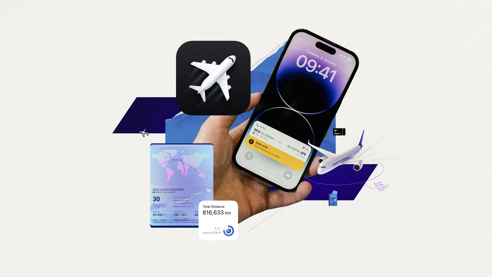
Conceived during — when else? — a long flight delay, Flighty puts key information front and center with an immediately understandable interface, live maps, and a look that mirrors time-honored airport design conventions. The best-in-class travel app is a flight tracker, airport navigator, and concierge — and with incredible implementations of Live Activities and the Dynamic Island, a companion that makes key information available at all times.

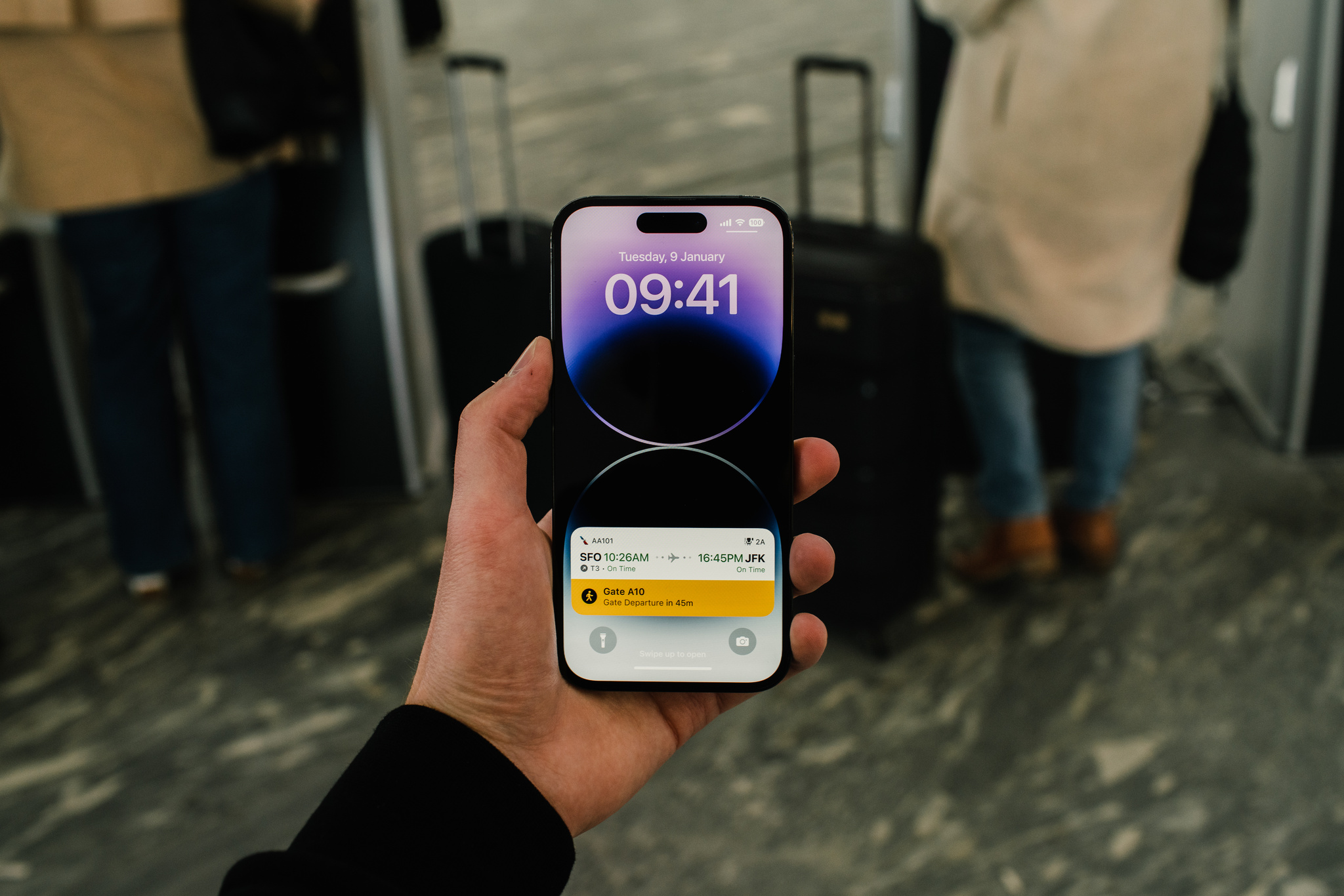
Flighty puts key information front and center at all times — especially through its best-in-class Live Activities.
“There’s something comforting about information always being there,” Jones says. “You don’t have to check your phone and think, ‘OK, I have to be at the gate in 32 minutes,’ and then, ‘Now I have to be there in 29 minutes.’ And I don’t know about you, but every time I walk on a plane, I look at my seat number, put it down, and immediately say, ‘Wait, what was my seat number?’”
Since its 2019 launch, Flighty has been an incredible example of the carefully crafted use of Apple technologies. “We’re really doing this out of a passion and love for the product,” says Jones, “We all had our lives changed by iOS and mobile, so we get really excited about adopting new technologies.”

Ryan Jones, Flighty
They’ve added a lot. Flighty supports widgets on the Home Screen and Lock Screen, highlighting content using Shared with You, and more. With a few taps, travelers can even live-share their flight path and arrival time with loved ones who may not even have the app installed — a wonderfully convenient feature for coordinating airport pickups.
We want Flighty to work so well that it feels almost boringly obvious.
Ryan Jones, Flighty founder
Flighty is consistently impressive in adjusting to the unpredictable nature of travel. “We really have to shine when things go awry,” says Jones. For instance, the app must account for how every single person will, at some point, lose their internet connection. “Whenever [someone] takes off, we have to assume that we won’t see them again until they land,” says Jones. The solve? At a certain point before a flight takes off, the Dynamic Island switches over to flight progress bars and counters, displaying minimal presentation in a simple circular chart that tracks a flight’s duration.

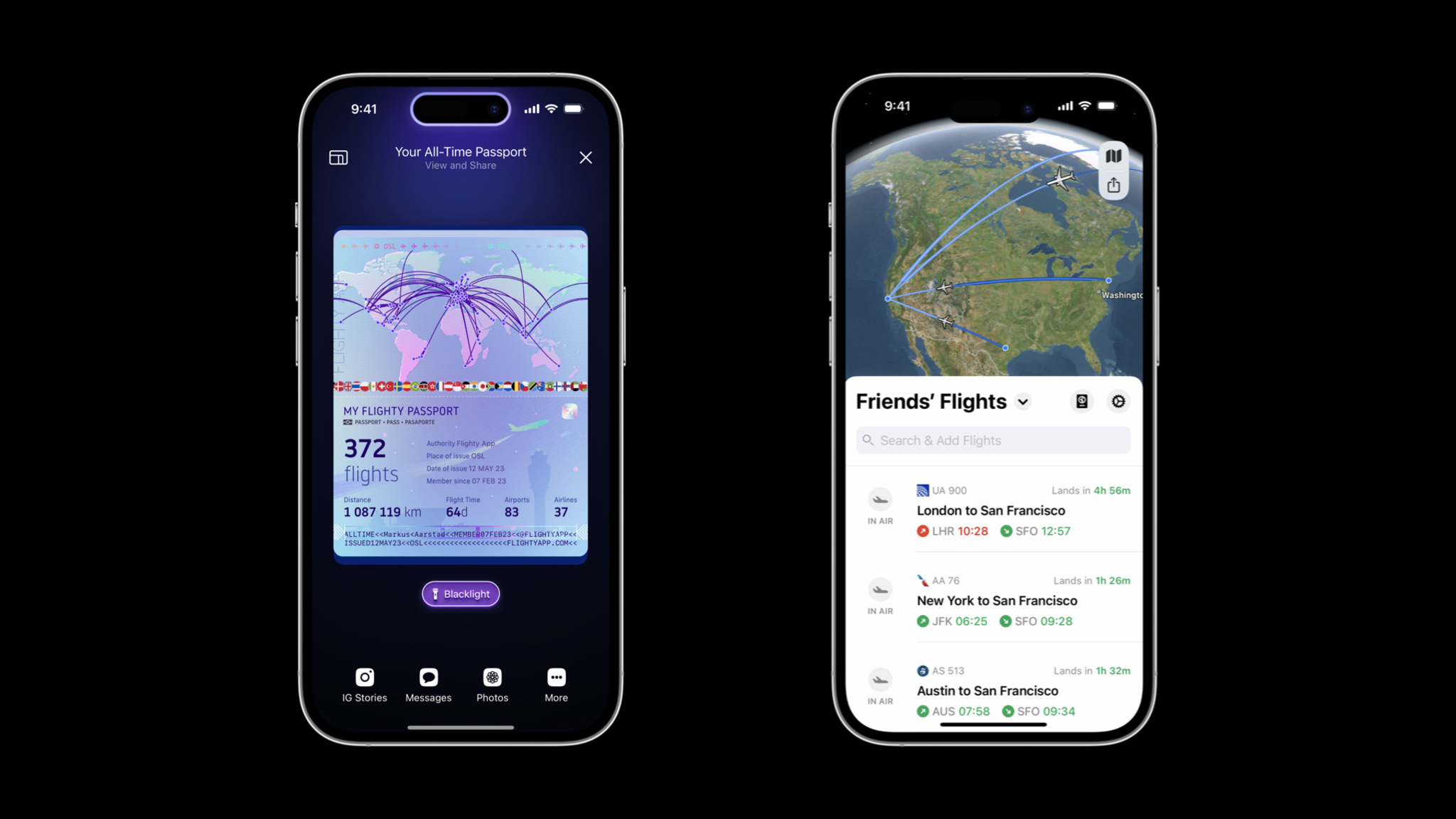
The Flighty Passport features shows your flights, miles, and travel stats, and the Friends' Flights screen is a convenient way to keep up with others.
Visually, both Live Activities and the Dynamic Island are designed to recall airport signage conventions that have been in place for decades. “That’s our real-world analogy,” Jones says. “Those airport boards have one line per flight, and that’s a good guiding light — they’ve had 50 years of figuring out what’s important.”
While the design process is comprehensive, it’s not always fast. “It’s so tempting to start pulling from your existing asset library to see if you can quickly put something together,” he says. To avoid falling back on old ideas, the Flighty team creates 20 design ideas during the concept phase. “It’s what fits on a sheet of paper,” he says with a smile. “You get to six or seven ideas and think, ‘OK, that’s it, there’s none left.’ But then you think, ‘Well, I have an idea that will probably look bad,’ and then you try it and it’s not bad at all.”
Flighty is even fun at home. The Flighty Passport feature shows flights, miles, and travel stats through gorgeous, shareable custom artwork. It’s just more proof that Flighty really is for every step of the journey — even being back home.
Download Flighty from the App Store
Behind the Design is a series that explores design practices and philosophies from each of the winners of the Apple Design Awards. In each story, we go behind the screens with the developers and designers of these award-winning apps and games to discover how they brought their remarkable creations to life.