-
Designing Notifications
Thoughtfully designed notifications are a powerful way to communicate timely information to people that they will find valuable and useful. Learn how you can design notifications people want to receive by making them beautiful, helpful, actionable, and respectful of their valuable time and attention.
Resources
Related Videos
WWDC20
WWDC18
-
Search this video…
Good morning.
Good morning, everyone.
How's it going.
It's nice to see everyone today. Hopefully you've enjoyed the conference this week. We're really happy to be here to start off the last day. So, my name is Jon Dascola, and later I'll be joined by my colleague Heena Ko. We're both designers on the human interface team here at Apple. And we're going to talk about designing great notifications. So, this year in iOS 12, we introduced a lot of great feature to really enhance the notification experience, both for you and everyone that uses your apps. And we think these features are really powerful, and could create a meaningful, but also mindful experience for everyone.
But, before we get into what's new, I think it would be helpful to take a trip down memory lane and see how the notification experience has evolved over the years, because knowing how we got here will help us make a better future. So, when iPhone launched, every alert was a blue box, model alert. Do you guys remember this? Every notification, every message, every invitation, it was an interruption that needed to be dealt with immediately.
Nothing would be on the lock screen, so at times, it was pretty cumbersome when you'd unlock the phone, right? Whatever missed messages you received were backed up and would appear a single box at a time. So, you could either ignore them, one at a time, or if you wanted to reply, you launched into the app to take action.
Then, in iOS 4, as more apps were sending push notifications, we started to queue them up on your lock screen. So, now people could see all of their missed notifications at a glance and choose the specific one they wanted to interact with.
A swipe on that row would launch into the app but all the other ones would be dismissed from the lock screen.
And they all went up to notification center. And that was a way to access all the other things you had missed.
So, because so many notifications were being accumulated, this became a really useful place to go and to see all the other activity on your phone. Next, we introduced rich notifications. As the quantity of notifications was increasing, we wanted to increase their quality.
Rich notifications are a great way to provide more context and information around each notification. That way you can see one, understand what it's for and get the extra information that you need to take action. And it all happens right in line.
You don't need to launch into the app and lose the context of what you're doing. And that leads us to where we are today and all the work that we've done to enhance the notification experience in iOS 12.
So, we're going to talk about some features that make the world better for you, as app developers. Ways to make your notifications more valuable, useful, and organized.
And then, we'll talk about how those features can create a better experience for everyone.
But before we get going, can we take a moment and be candid? Can we talk about the current state of notifications? Maybe not always the greatest. You know, people are getting a lot of interruptions. And they're not always for the right reasons, right. And we have way more apps than ever before. And they're sending more notifications than ever.
And because people are seeing so many notifications, it's so important to make sure that we're creating a really great experience for everybody that uses your app.
Because the best notifications, they're for connecting and communicating with people. I mean, that's what makes iPhone great, that real human connection. And then, you know, we have social notifications. I totally understand how these are important, right? People want to stay on top of their digital lives. Everyone likes their likes.
And then there's even the occasional notification about new sneakers or something, that could be super fun and really useful. But not all of these things all of the time. Again, all things in moderation.
So, as more apps are continuing to send more notifications and taking more of our attention, we really have to make sure we're doing the right thing. We need to remember that the best notifications are for connecting people and delivering meaningful information. Now, I know none of you here would ever do any of this, but there are some app developers that maybe go a little bit overboard. And this year, we've created a UI that makes it easier for people to control how their notifications are delivered.
And there's even an option to turn off all the notifications from an unhelpful app. So, in iOS 12, when you receive a notification on the lock screen, you could swipe left and access some actions, and you'll notice this year, we've added a manage button.
Tapping that brings in our newly designed quick tuning UI, which allows you to configure how the notifications from that app are being delivered. So, at the top, the first option is to deliver quietly. And these quiet notifications will be send directly into your notification center without interruption. It did not appear on the lock screen. It did not play a sound or haptic, or present as banners. And I think this is a really great option for an app that's sending you notifications that you want. Content that you're interested in, but you don't necessarily need to be interrupted by for every new post, right? So, you can access these notifications now on your own terms.
But also, right here in the card is a button to turn off all notifications from that particular app.
And we think having that shortcut is really handy.
But having to use it, it's not a great experience for anyone. We don't want people to have to turn off notifications because they're annoyed or frustrated. And as developers you don't want to lose the privilege to reach out to those individuals, right? So, by the time we're done here, we want to make sure that you have all the tools and information you need to make sure you're sending only the most meaningful notifications that you can.
Because if you send great notifications, you'll be, making everyone who uses your app happy. And if you've got happy people using your app, that's going to make you happy.
And if you guys are all happy and they're happy, that's going to make Heena and I real happy today. And being happy is good, right? So, let's get into it and talk through the notification journey and how to create the best notification experience.
We're going to start with the first run prompt, in that initial agreement and talk about all the best ways for you to make sure your notifications are allowed and delivered.
Then we'll talk about the best ways to provide value with all the notifications that you're sending.
Better ways to organize your content with notification grouping. And finally, how to make the most of rich notifications to create a really useful and holistic notification experience. So, let's get started and talk about that first prompt in asking for permission to send notifications.
This is a familiar screen, right? It's your one and only opportunity to receive permission to send notifications. And it's an important moment. And you should remember that you're asking someone to make the difficult decision here. I mean put yourself in their shoes right. They just downloaded your app. They're excited to give it a run for the first time. And then all of the sudden, they're interrupted. And then they're asked make this decision about receiving notifications.
How are they supposed to know, right? Especially if it's presented without any context and you're not letting them know why notifications are valuable, and if they've really had any time to experience your app. I mean why should they tap allow? So, this happens, right? They don't.
And that was it.
You had one shot, one opportunity to send notifications. And that was your only way to ask for permission. Well, in iOS 12, that's no longer the case.
We've created a new feature that allows you to send notifications directly and only into notification center, without running that initial prompt. It's your choice. You can continue to show the prompt and ask for the privilege to send notifications to the lock screen with the risk of being denied. Or, you can choose to deliver your notifications quietly and directly in the notification center.
So, they'll appear like this in your notification center list. And if we look a little more closely, you'll see the content within the notification platter is presented as it always is. Your information comes through as a normal notification.
But at the bottom, we extend down the platter and we add some buttons. Now the prompt is integrated within a notification. It's less disruptive. It's a non-model experience. So, you won't be stopped when you're in the middle of using that app and being asked about notifications. You see the prompt right when you're looking at your notifications center. And the prompt now provides more information. It's presented with in an actual notification. So, I can see what sort of content the app will provide. And now, I'll have a better understanding of their purpose so I can better judge their quality, and be better informed to make that decision.
So, let's look at some different categories of apps and talk about how they might go about requesting permission. So, we have social apps, news apps, games.
And let's focus on a news app for a moment. Let's imagine we're creating a new news service from scratch and we're working out our notifications.
Well, should we go to the directed notification center route? I mean that seems like a good idea, right? I mean there's a group of people out there that are interested in news. Maybe they're curious about what's going on in the world. But they don't feel the need to be interrupted for every single article that's posted. You know, especially if they've just downloaded the app and they're unsure of the content they might receive. I think the directed history route makes a lot of sense. But, you know I also see a very clear use case to ask for lock screen access too, right? People love breaking news. They want to be on top of what's going on in the world, as soon as it happens, right? I get it. So, what do we do? Well, if we start with the new world and talk about the cases that could be sent directly to notification center. So, if your app is sending content that can be consumed passively, and doesn't require critical or timely responses, then I think the directed notification center route is your best approach. It ensures that your content is delivered. It won't interrupt people. And most importantly, it gives them an opportunity to see your content and try your notifications before they have to commit to it. So, if our news app is sending longform articles, I think that makes sense, right? Or, social apps. I think they can deliver their likes and comments quietly. Games that are sending out promotional notification. Examples like that, I think they make sense to go direct to notification center. Now let's take a moment and talk about the traditional route. What sort of use cases make sense here? Well, if your apps need to deliver notification content immediately, if people need to see your notifications the moment that they're posted.
Or your app requires an urgent response to notifications, ask for permission. You know, maybe that news app is breaking news. Or your social app has a big messaging component, or games where you need to see your friends online. If you've got an app like that, then go for it. I think that makes a ton of sense to ask for lock screen access. But if you do, there's a few things to keep in mind while you're designing that experience.
Because if you do create a great experience here, I think it will greatly increase the probability that your notifications are going to be allowed. So, don't prompt or send this alert as soon as people launch your app for the first time. You know, give them a moment to experience your app, what you've built and what you have to offer.
And find a place within your app to explain why your notifications are going to be valuable. Let them know why you're sending notifications. And more importantly, why they need to appear on the lock screen. And finally, that prompt, well post it at the right time. Present it when someone understands the reason why they'll be receiving notifications from your app. Like if you're a delivery service, wait for someone to complete their order and explain the notifications will update them on its progress. Or if you're a travel app, notifications will be for flight delays and gate changes, right.
Because in either scenario, with the direct to notification center route or this one we want you to have the best opportunity to deliver your notifications. So, that's what's new when asking for permission to send out notifications. Remember, it's up to you. Both approaches are valuable and both should be considered. It's a decision that you're going to need based on your app and your app's particular content. So, now that you've taken all the right steps to make sure people will be receiving your notifications. Let's talk about how to make sure you're setting the best content in making notifications like extremely valuable for everyone.
And why is it so important that we're sending out great notifications? It's because our attention is valuable. Our attention is precious. Right? Interrupting people, it's a real privilege. And we need to respect that. I mean you've all felt this right? You're trying to focus on something, you're in the zone. I mean maybe it's happened this week, you're updating all your apps to adopt these great new APIs and then all the sudden . You're interrupted. And you stop. And you lose focus. And when the wrong thing comes at the wrong time it's frustrating. So, you've got to be extra considerate when we're sending notifications.
First off, we need to make sure we're sending great content and providing the highest quality of information. Everything you said in a notification has got to be meaningful.
Every notification should provide a specific purpose. Each notification should have a specific message to communicate or a task to complete. Notifications are not just a reason to get people to launch into your app.
So, Dark Sky, it's a really lovely weather app that sends particularly meaningful notifications.
See, I think the interesting thing about the weather is you really need to know about the weather once it's different. You know, if there's a change in conditions. And that's when Dark Sky sends these notifications, right? Rain is starting soon. That's what I need to know. Just really smart.
Door Dash is another great example. You get your notification when your food arrives. I mean everybody gets excited when their dinner is here, like what more do you need to know? It's perfect.
And HQ does the right thing with their notifications.
For a live game that requires you to be online at a specific time, a notification like this, it makes a ton of sense. So, what do they all have in common? Well, all those notifications, they served a clear purpose. They were presented for a specific reason with real information. They weren't just empty invitations to launch into your app. So, now that you're sending out really great content. It's important to consider when you're sending that content. So, be considerate when you deliver notifications.
And reminders is great. You can choose whether you want your notification to be delivered by time, or by location. So, you get the appropriate content whenever you need it.
And Headspace is great, they're one of my favorite apps. It's a meditation app that really helps with focus and clarity.
So, I think it's appropriate that they let me choose when a reminder comes through. Because it would be terribly ironic if they were the ones sending me frustrating notifications at inopportune times throughout the day. Headspace is really great.
And here, I love this screen with CNN, right. After you allow alerts, they ask you to choose the alert frequency. So, it's up to me to decide how often I would like to receive their content. It's such as smart way to manage and configure your notifications you know. Because as a user, now I have some expectations around what that notification experience will be. And here's a notifications from Duolingo. So, I was trying to learn a new language. I got a bit distracted here working on this presentation, so I missed a few sessions. And rather than continuing to send me notifications that I'm not interacting with, they decided to pause them.
And I just think that's really considerate. Because I could totally understand the argument right, why they might want to send me more notifications at a time like this and really encourage me to get back and re-engage with the app. But with the new tuning features we announced, if I get annoyed by those notifications, I can easily turn them all off.
So, for them, doing the right thing in the short term, while it might seem like the harder decision to make, I think it's going to pay off in the long run. So, in all cases, it's really important to consider how and when you're delivering notifications. And finally, we want to make sure your people are in control of the content that they're receiving. I mean there's a real trust relationship that's created when someone allows notifications from your app. They're making space for you to interrupt them with your content, right? And as we've discussed, it should be really valuable.
But not all things have that same level of value or importance to all people. So, let's talk about giving everyone control on how their content is delivered, right? So, we've redesigned settings this year to more clearly visualize the different delivery methods of notifications. We hope that with more clear and graphic UI, it will make it easier for people to adjust how they're receiving your different notifications.
And if you notice at the bottom here, we've also added a link to your third-party custom notification settings. And providing that link is even more important now because of our new tuning UI. Because if someone decides to tap turn off, we don't just immediately stop all the notifications from that app, but we present a confirmation step.
So, in this action sheet, you could choose to turn off all notifications from the particular app, or tap a button, to go into that app's particular custom notification settings. And again, we want people to be in control of the types of content that they receive. So, while we hope that turn off everything button is a last resort, we want to encourage people to get into your app settings and customize the notification categories you have in a more granular way.
So, with this extra visibility you know it's really important to make sure these settings pages are well-designed.
So, let's look at a few examples.
ESPN is an app with really detailed settings. And they've done a great job with their design. There's like a great sense of hierarchy and all of their content is tailored to my interests. And when I drill down and see the screen, they have specific details for each type of notification that you can receive. You know, basketball is different than baseball. Right. I have all the controls that I need to receive exactly the right notifications from ESPN. And "The New York Times" app is great. I have the options to configure the different categories or different sections that are alerting me.
You know I might not find sports or politics helpful, but I can still receive breaking news and top stories. And I think this is really smart for "The New York Times" to have implemented. Because not everyone may appreciate interruptions every single category that they offer.
So, for allowing this topic level control, it assures people to configure the experience to their liking without resorting to turning off all notifications from that app.
So, it's really important, this set of control is supported in your app in a well-designed way. All right.
So, those are the important things to remember when creating notifications. Now, you're going to be sending out some really valuable information.
The next thing is to talk about notification grouping. And this is a new feature in iOS 12 to help everyone keep their notifications, you know all those great, and valuable content you'll be receiving, more organized. So, in iOS, we've always appreciated the convenience of seeing notifications on the lock screen.
The chronological list is really helpful to organize.
And it's great to see the content of notifications without having to interact with the device.
You just pick up the phone and everything is there, it's all visible.
But you know, there gets to be a point where that long chronological list starts to break down. Whenever there's a lot of different content coming on the screen, right? Especially multiple messages, or if you have group chats happening all at the same time, it's really difficult to follow. So, that's when we decided to start grouping notifications.
Now, all your related content is organized together.
A simple tap on each group expands it open and you can interact with each notification individually. And by default, notifications will group together by app. And for most cases, that make sense. But you know there's some circumstances when sorting them out in a more detailed way can be helpful. And messages is a perfect example. I don't think it would be the most useful thing to see every missed message from every conversation thread and group chat you're having all lumped together into a single group.
So, to more clearly organize everything we create a new group for each conversation. And we call each individual group a thread.
So, let's take a moment and talk about notification threads and what the best ways may be to organize your content. So, notification grouping uses the existing thread identifier API.
This API was introduced as part of the notification content extensions. We expanded its use to create notification groups.
The thread identifier can be any string that you want and the notifications with the same thread identifier are all grouped together. That's it. Super simple.
So, threads make a lot of sense and you have separate conversations to group together. But what about other types of content? How should we handle grouping in those cases? Well, let's look at news. Each source is broken out into a separate thread.
You can see there's a group from "The New York Times." A group for Quartz, and a group from "The Washington Post." And it's a really helpful way to find and organize content delivered from the news app. And let's look at another example. Podcasts. They really do the smart thing with their notifications. They create a special thread that groups together all of your new episodes. And what they do is they resisted the temptation to declare each individual Podcast a separate thread.
Because remember, threading is about consolidating and organizing your content. So, when scrolling through your notification history, I think it's a much better experience to see all new Podcast episodes in a single group, rather than a bunch of discrete groups separated out and mixed together amongst all of your other missed notifications. Because, if there's a single group, a tap will expand it open and reveal all of the related content.
Everything is together.
Everything is organized. And everything is easy to find. So, while threads can be incredibly valuable, it's really important to not create too many.
They should be used to highlight and distinguish meaningfully different types of content.
So, remember it's okay to leave the default behavior of grouping all of your apps notifications together. Often that's going to be the best experience for people to find and interact with your content. All right, so that's notification grouping, and I think we're doing pretty good so far. You know, people have agreed to receive your notifications now.
You're respecting their attention. You're sending good content at relevant times. If it makes sense for your app, you're grouping your content together by a few relevant threads.
We're moving. Now, we need to make sure the rich notifications are rounding out the experience.
And it's just so important, it's really important to create useful rich notifications. Because as I mentioned earlier, rich notifications are a way to provide more context and information to each notification.
Now, we want people to take action on them, without losing the context of what they're doing.
I say, like every notification should be like a little self-contained package of information to allow me to complete a specific task. I shouldn't have to launch into the app to find value in a notification. And photos is a great example. I can see that my friend added a new image to a shared photo stream.
And with 3D touch, when I touch on it, I can see the big, full-sized version of the image that was added. And below there's a description. And with the quick action buttons, I can either like it, or leave a comment right in line. I don't need to leave the context of what I'm currently doing to take action on the notification. I tap like. I swipe it away and I'm back to the lock screen.
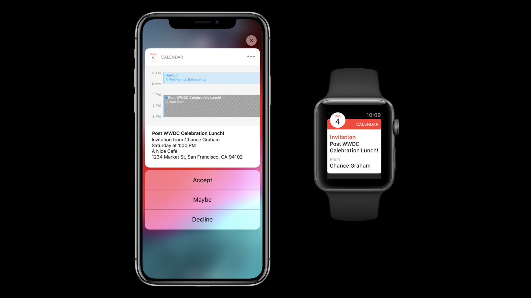
Calendar is another great example. I see I have an invitation to an event on my lock screen. And I use 3D touch and press on it, I see my availability right in the notification.
Again, I don't need to launch into Calendar to see my day. And then there's some great quick options below. I can accept the invitation right in line. So, if we look at messages, with our new notification grouping UI, my conversation with Heena is all grouped together.
Now, when I press on the notification group, I'm seeing all of that group's content together. All of the individual platters that were stacked in the group are consolidated together in this view. I can read the entire thread right here.
And now, in iOS 12, we've added interactivity to the rich notification views. So, you can double tap on a specific messages bubble and access our tap back UI.
So, I tap like, and I can send that acknowledgment right back to Heena.
So, as we mentioned, if you've created individual threads for your content, you can also have a threaded or consolidated rich notification. So, if we look at Podcasts. All of their new episodes are grouped together here on the lock screen.
When I press on that stack, I get a single rich notification that summarizes each of the new Podcast episodes that have been released.
There's a custom design with each show's artwork.
The episode title and a short description.
And because we can have discrete tap regions, there are separate play buttons for each episode. I mean, I just think this example is great. It checks all the boxes for making a great rich notification. There's detailed content, nice images, custom controls, and rich interactions.
It's a great way to finish the notification experience.
So, to summarize, when it comes to that first run experience, you have the question, did you ask for lock screen access, or deliver quietly in the notification center. Well, I think it depends on your content. Is it timely? Does it require an urgent response? Then go on, ask for permission to send notifications to the lock screen.
If you're sending passive content that doesn't require an immediate response, then delivering directly to notification center could be the right approach.
But either way it's your decision to make. This should be based on the needs of your app. Next, we need to make sure we're really providing value with our notification content and sending just like the highest quality notifications.
So, they need to be meaningful content. We should be sending specific information.
Notifications are not just a reason to launch into the app. And we've got to have a well-designed settings and configuration UI so people can easily tailor their notification experience from within your app. Notification grouping it's a great way to organize your content. So, by default, all notification from your app will group together.
And you can use the threat identifier to create threads, if you need more nuanced grouping.
But remember, only create threads when necessary. Don't overdo it.
And finally, rich notifications should be created to provide that extra bit of content around the notification.
Each notification should be a specific task to complete.
You can add images, video, audio, and custom content. And now, interactivity to create a holistic notification experience. So, I mean that was a lot, right? That was a lot to take in, a lot to do, a lot to consider. But, it's not everything. There's still something else to consider. And for a lot of people it's the most important. And it's definitely the most personal part of the notification experience.
The Apple Watch. So, I'd like to invite my fellow designer, Heena Ko here, to talk about making great notifications on the Apple Watch. Thank you. Thanks, Jon.
Okay. So, we just heard about the importance of notifications on the phone. So, why think about notifications on Apple Watch? Well, we consider Apple Watch to be our most personal device. It states unlocked on your wrist, so you stay connected. But because it's so lightweight, you can stay focused on what you're doing. And particularly for Apple Watch, notifications are really great and incredibly effective. They're glanceable and the interactions are lightweight. And great notifications, they send you valuable and timely information. Or, they can encourage you to reach your health goals.
And in some cases, they tell you critical information, like if you've had an elevated heart rate. Notifications are an essential part of the Apple Watch experience. In fact, we'd go as far as saying that notifications are the primary way people interact with apps on Apple Watch. There's another important reason why you may want to think about notifications on Apple Watch, and that's because they can be pushed to either device.
You see, we coordinate alerts. So, we send them to the device that's most accessible to you. So, if your phone is locked, it's in your bag, in your pocket, which is a lot of the time, then that notification gets sent to the watch. So, you want to make sure that that notification looks great in both places.
Okay, so here's a picture I took on a hike on Mount Tam the other week. It's really beautiful up there. While I was going on a hike without my phone, I was able to get this notification from Dark Sky about an upcoming thunderstorm.
So, now, with Apple Watch Series 3 with cellular, notifications on the watch are more important than ever. I can go hours without my phone. And still receive notifications and stay connected. Okay, so you may ask, how do I make them look great on both devices? Well, we try to make it as easy as possible for you by giving you some stuff for free.
So, let's take a look.
Take this notification from one of my favorite Podcast Apps Castro. When that phone notification is pushed to the watch, some elements come with it with minimal work. Like, the image attachments, as well as the title, the body, and any relevant quick actions.
So, here I'm able to add this Podcast app to my queue from my watch, so it's right in my phone when I want to listen to it. By simply adding a few additional elements, the watch's notification experience is so much better. Okay, so there are additional ways you can customize your watch notifications.
You can add a sash color. You can add a background color.
You can add images, icons and even inline video to make your notifications more visually rich.
Okay, and now if you have a WatchKit app you can create interactive notifications. Interactive notifications are a new feature in WatchOS 5. They allow for more interactivity right in the notification, so you don't even have to launch the app. We're really excited about this one.
Okay, so here's a notification from a fictitious ride sharing app. You guys know this. We all get these after every single ride. And occasionally I'll open the app and rate the ride right after the ride is over. But sometimes, actually a lot of times, I forget to do it.
So, now in WatchOS 5 apps can create interactive notifications. Here's one from DiDi, I ride sharing app.
So, they've included the ability to rate and pay right in the notification. I just have to rotate the digital crown, tap the stars, hit pay, and I'm done. So, this is a great example of an interface that clearly communicates the purpose of that notification, which is to encourage me to submit a rating after my ride.
Pay By Phone is an app that allows you to pay for your parking spot remotely.
It's really convenient when I'm still really far from my car and I need to extend my time.
Here's a notification from them, letting me know that I only have 10 minutes left on my parking spot. It allows me to extend my time right in the long look. I just have to rotate the digital crown, and I tap steppers, and that's all I have to do to extend my time. So, this is a great example of a quick interaction. I was able to extend my parking time with just a couple of taps. So, amongst my friends, I'm oftentimes the person that chooses the restaurant and makes dinner reservations. And because of traffic and weather, you name it, people are always running late. So, here's an interactive notification from Yelp, letting me know that my table is ready. And these new notifications, they allow me to extend my checking time and in this one, for up to 45 minutes right in the notification. So, we don't need to give up our table if people are running late.
Okay, so rich notifications are particularly good for moments of quick data input. Here's a notification from a fictitious medication reminder app. It's reminding me to take my medication before the end of the day.
So, it not only reminds me to take my medication at the right time, but it also provides a range of ways to respond. I can say I took a single medication, or I can tap the take all button to say that I've taken both.
So, this is really great, because this is something that I had to do every single day.
Okay, so what do these notifications have in common? Well, they were informative. At the same time, they're succinct.
They were visually rich. These used images, videos, and icons to make the notifications much visually richer.
They're actionable. I was able to accomplish a tone of things without even having to open the app. And lastly, interactions on the watch are best when they're quick. We're going to make notifications richer, but we don't want to recreate the app experience.
Okay, something you can do to make notifications even more effective is to get to know your audience.
And tailor notifications to individuals. It can make a huge difference in how they experience your app. My Weather is an adorable app that sends me forecast notifications every morning and it's customized to my location.
I really love receiving notifications from Wallet on my watch. It's especially great, when you're at the airport, and you're dealing with lots of luggage. Or you're at the store dealing with lots of groceries, they're also really handy when going to concerts.
So, here's a concert ticket I got from Wallet. It arrived right when I got to the venue.
It also contained a full-screen QR code that allowed me to enter the venue and I didn't even have to pull my phone out.
This is a great example of customizing the timing of when I received a notification. It arrived right when I needed it and provided me with everything I needed for the event.
Okay, so Qantas Airlines has really great interactive notifications, and they allow you to share your flight time with that clutch friend that's going to pick you up from the airport. Here, my friend Gabriel has just sent me his trip information through the Qantas app.
It includes his ETA, as well as the option to set up a pickup reminder, which I'm totally going to use. Later in the evening, I'll receive the pickup reminder, along with a suggested time to leave.
And it shows me exactly where I can pick him up, as well as the options for directions and it includes the option to send him a message letting him know that I'm going to be late. So, must know that I'm in LA.
This is an excellent example of customizing notifications along an entire journey. They utilize time and location as well as just simply providing helpful tools to make sure people have a great experience from start to finish. Okay, so, at this point, everyone here should be a notification expert. But we covered a lot. So, let's do a quick recap. Okay the first run prompt. Notifications are oftentimes sensitive. But if they're not considering sending notifications directly to notification center. You won't be interrupting people and folks can read them on their own time.
Providing value and sending great content. Remember notifications are about making human connections and conversation.
They're also about delivering valuable information.
Consider delivery.
Consider providing ways for people to customizing notifications and incorporate things like time and location when sending them.
Okay, notification grouping. So, iOS and WatchOS will group notifications by app by default. And most of the time, that should be totally okay. But consider threading related content to have discrete meaningful groupings. People are really excited about this one.
Okay, rich notifications.
Consider creating rich education so people can accomplish more right in the moment. And last, but not least, consider notifications on both devices. You'll be providing a great experience in any circumstance. So, the next time people hear this sound , people will be delighted because you value their attention, and sent them something really great.
Thank you guys. So, for more information about notifications, check out these related talks.
[ Applause ]
-