App Store Connect Help
App Store Connect Manage App Accessibility Larger Text evaluation criteria
Larger Text evaluation criteria
Description
Users can adjust the size of text and icons to make them more legible, visible, and comfortable to read.
Goals
Everyone should be able to use your app, regardless of whether they have a disability. Ensuring that extra large fonts work well in your app makes the interface more convenient and accessible to more people. While some low-vision or legally blind users may be able to manage default font sizes by using screen zoom or holding their device extremely close to see the text and small icons in your app, this isn't a good user experience.
The following sections provide more detail about how to determine whether your app supports Larger Text well. The goal is to help ensure users with disabilities can leverage all common tasks of the app, therefore performing this evaluation will help you determine whether to indicate your app Supports Larger Text on the App Store.
Getting started with testing
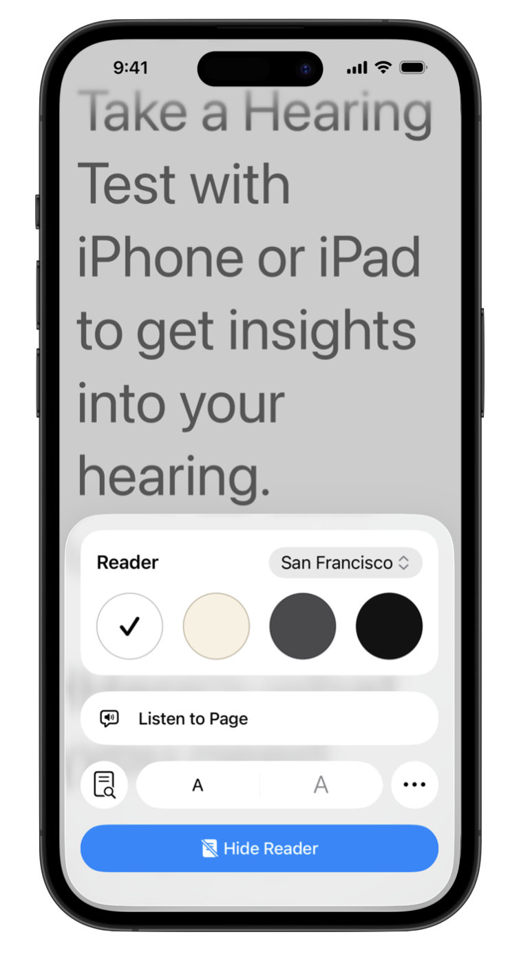
Allow primary content such as body text to scale as large as possible, while retaining usability and informational hierarchy in your app. Many accessibility guidelines recommend allowing users to enlarge text to 200% or larger than the default size. Dynamic Type on iOS, for example, reaches sizes larger than 200% at the AX3 size, and allows body text sizes over 300% at the AX5 size. Testing your app at the largest sizes helps you catch issues such as truncated or overlapping text.
Be sure to design for and test small, medium, large, and extra large accessibility sizes.
While you’re not required to use Apple frameworks to indicate support for Larger Text, we recommend reviewing how Apple’s platform and apps respond to the systemwide settings to understand what a good experience is like for users. If you offer your own in-app setting, it should either support similar functionality to the systemwide setting, or offer more granular user interface customization.
Design and test your app at all text sizes, including extra large accessibility sizes.
-
For iPhone, watch “How to adjust text size on iPhone or iPad” and visit Make text easier to read on iPhone.
-
For iPad, watch “How to adjust text size on iPhone or iPad” and visit Make text easier to read on iPad.
-
For Apple Vision Pro, visit Text display settings on Apple Vision Pro.
-
For Apple Watch, visit Adjust text size and other visual settings on Apple Watch.
Indicating support for Larger Text
You can indicate that your app supports Larger Text if users can enlarge text to at least 200% or the maximum font size for the system. Allow users to resize text and meaningful icons as large as possible. Body text in the primary iPhone, iPad, and Mac views should increase in size without affecting readability through overlapping layouts or severe truncation. If you have controls that can't reasonably increase in size, review the details below for other ways to make those perceivable, usable, and understandable.
Don’t rely on system-provided assistive technology like Zoom or Hover Text to claim support for Larger Text. These features are available to users regardless of your app’s implementation, so users will already be aware that they can enlarge most or all on-screen text to a sufficient size using Zoom or Hover Text.
The Larger Text label is useful to users of your app as a way to determine whether the user interface of your app supports font size enlargement separate from these built-in features like Zoom. You may indicate support for Larger Text, either by using an Apple-provided feature like Dynamic Type, or by using your own in-app font size control to achieve equivalent font sizes.
You’re not required to adopt Apple frameworks to indicate support for Larger Text, but we recommend detecting when a user has Apple system settings enabled so they don’t have to manually update another setting for the app to function as expected. If you offer your own in-app setting that has additional customization or granular controls, you may not need to use the Apple system setting.
If third-party or user-generated content is required in your common tasks, refer to the detailed guidance for third-party content on the Overview of Accessibility Nutrition Labels.
Use the system font size, or manage your own.
Most iOS apps typically use Dynamic Type, but some developers of games or apps that rely heavily on the use of text may choose to manage their own font sizes with an in-app setting. For most apps, using system frameworks is easier and more reliable than implementing your own.
Apple Books is a good example of an app that supports larger text well, but doesn’t rely on Dynamic Type. While the Books app doesn’t leverage the system font size setting, it offers more granular controls. For example, users can change text to their preferred size, and the app’s layout changes from two columns to a single column at larger text sizes in landscape orientation, so that low-vision users can perceive more words in an uninterrupted line of text.
Safari on iOS is another great example of an app with a custom font size controller. Since not all web pages scale to larger text sizes well, Safari allows users to adjust the font size for each site they visit. If your app uses a web view as part of its common tasks, provide a font size controller or let Safari handle this task for your users.
Use responsive design principles to adjust layout and information hierarchy based on needed text size.
Consider which text to enlarge to reinforce a clear information hierarchy to low-vision users of your app, and prioritize scaling the main content areas before repeated, predictable navigational elements.
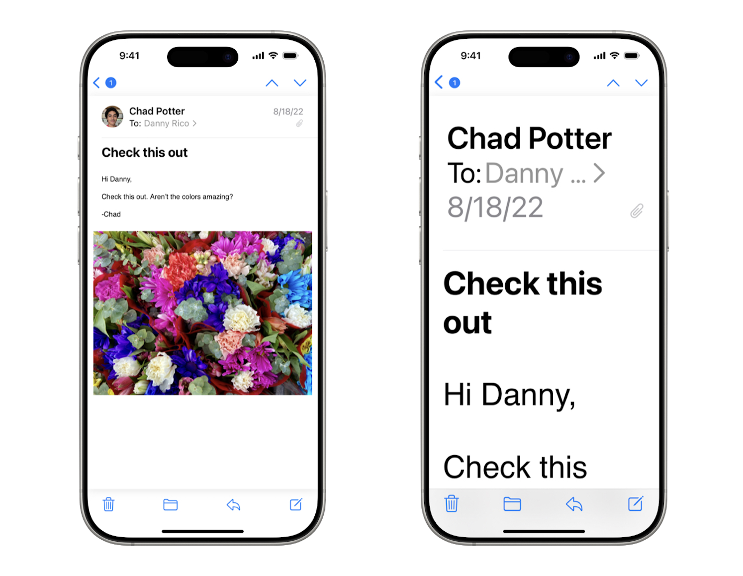
Consider the value of screen real estate when determining which elements to scale. For example, the Back and Edit buttons on iOS remain small in the example below because they are repeated, predictable, and secondary elements of the interface. Primary content and action buttons are enlarged, extending to full screen width and lengthening the page to use the available space.
Smaller side-by-side elements may overlap when enlarged, so consider wrapping them onto a new line or laying them out vertically rather than horizontally. In the example below, the layout of the message sender, receiver, and date changes from horizontal to vertical to support larger text sizes.
Keep in mind that some features, like Tab Bars, don’t grow with dynamic text to avoid overlapping valuable screen estate. Consider other ways to make those elements accessible, such as the Large Content Viewer.
Avoid overlapping text and excessive or unusable truncation.
Scaling text to much larger sizes may produce unpredictable results, especially on devices with smaller screens. As text is enlarged, consider how that changes the experience:
-
Content may overlap making it difficult to read.
-
Content designed for a single line might become truncated, showing only the first few characters.
Follow these principles for a great experience:
-
Avoid overlapping text.
-
Avoid truncating text to the point that it becomes unreadable or ambiguous for the user. Consider allowing the text to wrap to two or more lines instead of truncation.
-
If text is truncated, ensure that users are still able to access the same information as if the text were smaller. For example, in a list view, you can truncate text to a single line or two as long as the full text is available in a different view so users can dive into the details.
-
Test your app's larger text layout with different languages. In addition to languages with a longer average word length, test right-to-left languages and those with larger ascenders, descenders, and diacritics that may by clipped by layout constraints.
Larger Text on tvOS apps
Scale most text in your tvOS app to retain a relative information hierarchy. Section headings and media titles must remain larger than less important description text, even if the scaling isn't exactly proportional.
Rather than focusing on a particular percentage increase, scale the smallest text element as large as possible while retaining the overall usability, information hierarchy, and feel of your app. Watch Prepare your tvOS apps for Dynamic Type for tips on adopting Dynamic Type and design considerations for larger text sizes in tvOS.
You can indicate support for Larger Text in your tvOS app by supporting the largest Dynamic Type size or an equivalent font size using your own implementation.
Larger Text on watchOS apps
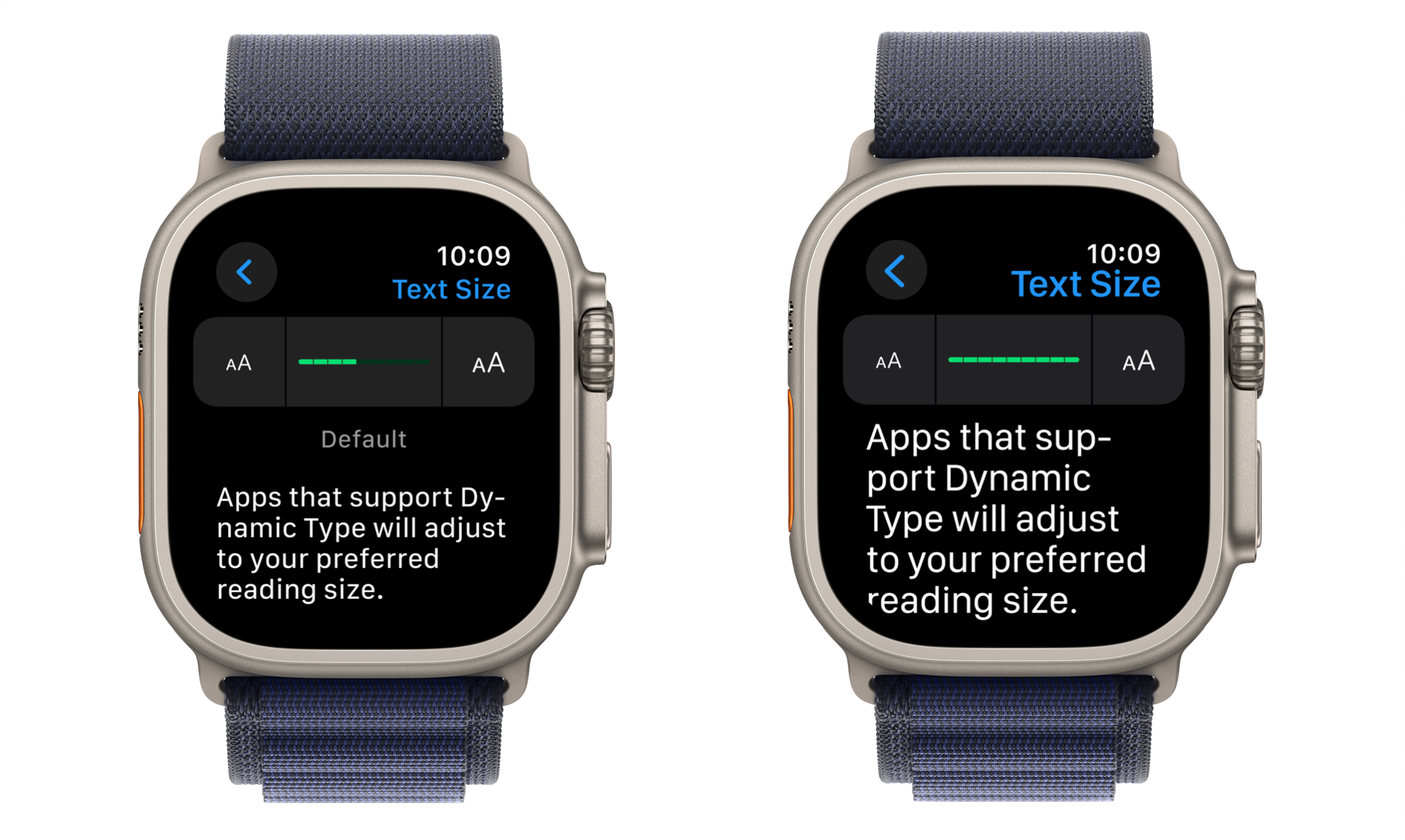
Because Apple Watch has a smaller screen, the largest Dynamic Type size on watchOS is larger than 140% of the default size. You can indicate support for Larger Text on your watchOS app by implementing Dynamic Type or by supporting an equivalent or larger size for body text or other primary content.
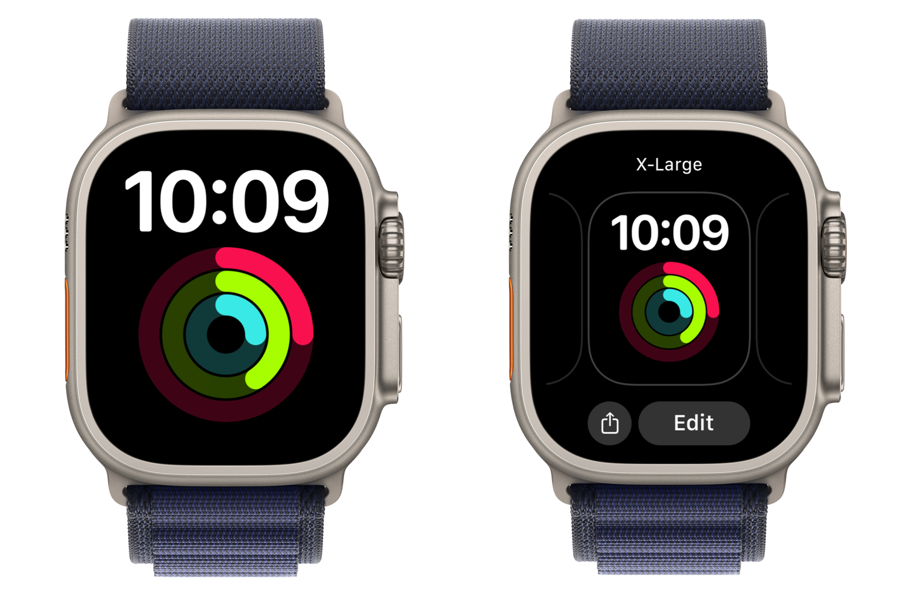
You might also consider some of the techniques employed by the X-Large watch faces, where each complication can be set up as its own watch face, taking advantage of the full screen size. Low-vision users can still view multiple complications (including your app’s watch face complications) by swiping through each of their saved watch faces.
Even after you’re able to indicate support for Larger Text in the common tasks of your app, there are likely further improvements you’ll be able to make to the accessibility of your app. Re-evaluate your app’s support for Larger Text every time you update your app. Set a goal to make your app more accessible to more people in every release.
Learn more about the evaluation criteria for VoiceOver, Voice Control, Dark Interface, Differentiate Without Color Alone, Sufficient Contrast, Reduced Motion, Captions, and Audio Descriptions.
Human Interface Guidelines > Vision
Human Interface Guidelines > Typography
Scaling Fonts Automatically Applying custom fonts to text