Panels
In a macOS app, a panel typically floats above other open windows providing supplementary controls, options, or information related to the active window or current selection.
In general, a panel has a less prominent appearance than an app’s main window. When the situation calls for it, a panel can also use a dark, translucent style to enable a heads-up display (or HUD) experience.
When your app runs in other platforms, consider using a modal view to present supplementary content that’s relevant to the current task or selection. For guidance, see Modality.
Best practices
Use a panel to give people quick access to important controls or information related to the content they’re working with. For example, you might use a panel to provide controls or settings that affect the selected item in the active document or window.
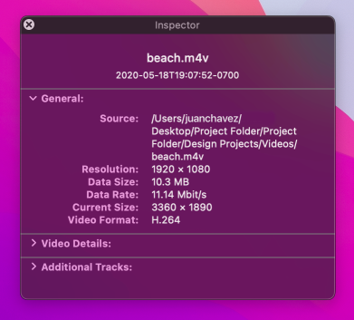
Consider using a panel to present inspector functionality. An inspector displays the details of the currently selected item, automatically updating its contents when the item changes or when people select a new item. In contrast, if you need to present an Info window — which always maintains the same contents, even when the selected item changes — use a regular window, not a panel. Depending on the layout of your app, you might also consider using a split view pane to present an inspector.
Prefer simple adjustment controls in a panel. As much as possible, avoid including controls that require typing text or selecting items to act upon because these actions can require multiple steps. Instead, consider using controls like sliders and steppers because these components can give people more direct control.
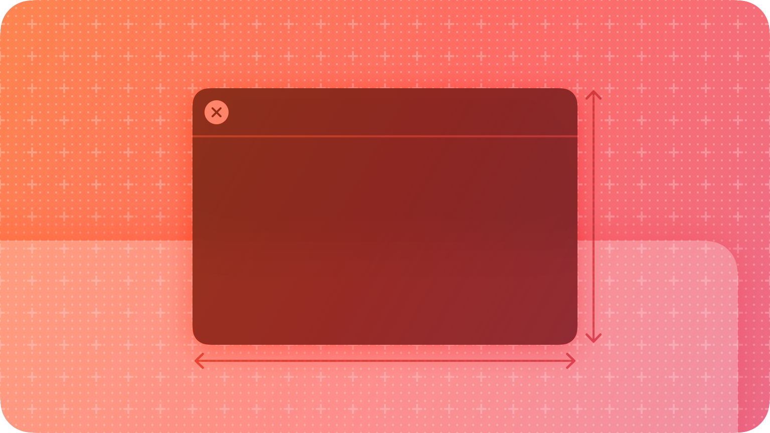
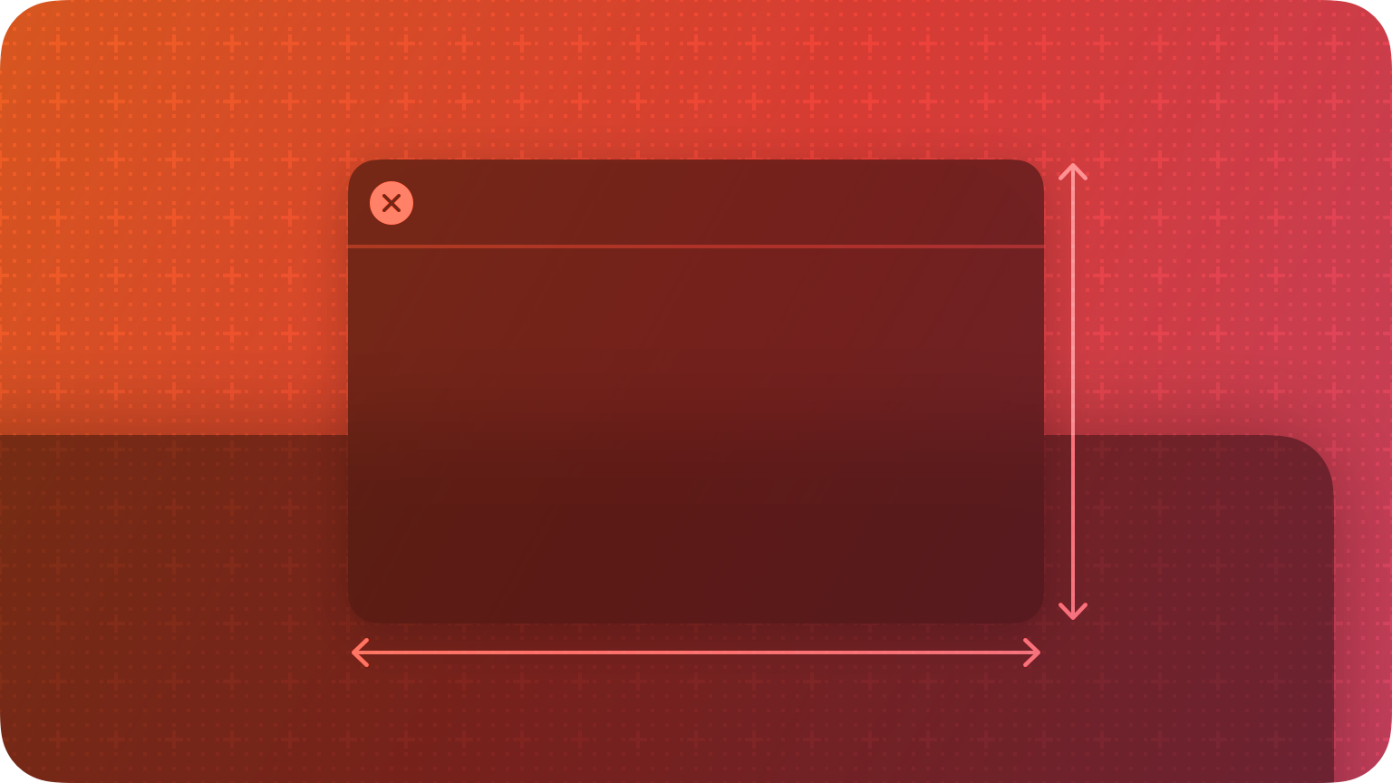
Write a brief title that describes the panel’s purpose. Because a panel often floats above other open windows in your app, it needs a title bar so people can position it where they want. Create a short title using a noun — or a noun phrase with title-style capitalization — that can help people recognize the panel onscreen. For example, macOS provides familiar panels titled “Fonts” and “Colors,” and many apps use the title “Inspector.”
Show and hide panels appropriately. When your app becomes active, bring all of its open panels to the front, regardless of which window was active when the panel opened. When your app is inactive, hide all of its panels.
Avoid including panels in the Window menu’s documents list. It’s fine to include commands for showing or hiding panels in the Window menu, but panels aren’t documents or standard app windows, and they don’t belong in the Window menu’s list.
In general, disable the minimize button in a panel. People don’t usually need to minimize a panel, because it displays only when needed and disappears when the app is inactive.
Refer to panels by title in your interface and in help documentation. In menus, use the panel’s title without including the term panel: for example, “Show Fonts,” “Show Colors,” and “Show Inspector.” In help documentation, it can be confusing to introduce “panel” as a different type of window, so it’s generally best to refer to a panel by its title or — when it adds clarity — by appending window to the title. For example, the title “Inspector” often supplies enough context to stand on its own, whereas it can be clearer to use “Fonts window” and “Colors window” instead of just “Fonts” and “Colors.”
HUD-style panels
A HUD-style panel serves the same function as a standard panel, but its appearance is darker and translucent. HUDs work well in apps that focus on highly visual content or that provide an immersive experience, such as media editing or a full-screen slide show. For example, QuickTime Player uses a HUD to display inspector information without obstructing too much content.
Prefer standard panels. People can be distracted or confused by a HUD when there’s no logical reason for its presence. Also, a HUD might not match the current appearance setting. In general, use a HUD only:
- In a media-oriented app that focuses on movies, photos, or slides
- When a standard panel would obscure essential content
- When you don’t need to include controls — with the exception of the disclosure triangle, most system-provided controls don’t match a HUD’s appearance.
Maintain one panel style when your app switches modes. For example, if you use a HUD when your app is in full-screen mode, prefer maintaining the HUD style when people take your app out of full-screen mode.
Use color sparingly in HUDs. Too much color in the dark appearance of a HUD can be distracting. Often, you need only small amounts of high-contrast color to highlight important information in a HUD.
Keep HUDs small. HUDs are designed to be unobtrusively useful, so letting them grow too large defeats their primary purpose. Don’t let a HUD obscure the content it adjusts, and make sure it doesn’t compete with the content for people’s attention.
For developer guidance, see NSWindowStyleMaskHUDWindow.
Platform considerations
Not supported in iOS, iPadOS, tvOS, or watchOS.


