Visual design
Animation
Animation can offer a layer of additional visual context to the content that appears onscreen. When used appropriately, animation can convey status, provide feedback, enhance the sense of direct manipulation, and help users visualize the results of their actions.
Use animation judiciously. Don’t use animation for the sake of using animation. Excessive or gratuitous animation is distracting.
Strive for realism and credibility. People tend to accept artistic license, but they can feel disoriented when movement doesn’t make sense or appears to defy physical laws.
Use consistent animation. Users are accustomed to the subtle animation used throughout CarPlay, including smooth transitions and physics-based scrolling. Custom animation should be comparable to the built-in animations.
Make animations optional. When the option to reduce motion is enabled in accessibility settings on the connected iPhone, your app should minimize or eliminate application animations.
Branding
Successful branding involves more than just displaying a logo throughout your app. Great apps express their unique brand identity through smart font, color, and image decisions.
Incorporate refined, unobtrusive branding. People don’t use CarPlay apps to see advertising. If they’re using your app, you’ve already sold them on it. For the best experience, subtly incorporate your brand through your app’s design. For example, consider using colors from your app icon throughout the interface.
Focus on consistency and functionality over branding. Make sure your app feels like a CarPlay app. It should be intuitive, easy to navigate, easy to use, and offer functionality that's useful while driving.
Adhere to Apple's trademark guidelines. Apple trademarks should not appear in your app name or imagery. See Apple Trademark List and Guidelines for Using Apple Trademarks.
TIP The App Store offers more opportunities to highlight your brand. For guidance, see App Store Marketing Guidelines.
Color
Color can indicate interactivity, impart vitality, and provide visual continuity.
In general, choose a limited color palette that coordinates with your app logo. Subtle use of color is a great way to communicate your brand.
Avoid using the same color for interactive and noninteractive elements. If interactive and noninteractive elements have the same color, it’s hard for people to know where to tap.
Test your app’s color scheme under a variety of lighting conditions in an actual car. Lighting varies significantly based on time of day, weather, window tinting, and more. Colors you see on your computer at design time won’t always look the same when your app is used in the real world. Consider how color brightness may affect driving conditions at night, and how low-contrast colors may wash out in direct sunlight. Always preview your app under multiple lighting conditions to see how colors appear. If necessary, make adjustments to provide the best possible viewing experience in the majority of use cases.
Favor dark backgrounds. Light backgrounds can be distracting, especially at night. In general, light content on a dark background tends to work well in most lighting conditions.
Be aware of colorblindness and how different cultures perceive color. People see colors differently. Many colorblind people, for example, find it difficult to distinguish red from green (and either color from gray), or blue from orange. Avoid using these color combinations as the only way to distinguish between two states or values. For example, instead of using red and green circles to indicate offline and online, use a red square and a green circle. Some image-editing software includes tools that can help you proof for colorblindness. Also consider how your use of color might be perceived in other countries and cultures. In some cultures, for example, red is used to communicate danger. In others, red has positive connotations. Make sure the colors in your app send the appropriate message.
Use sufficient color contrast ratios. Insufficient contrast in your app makes content hard to read for everyone. Icons and text might blend with the background, for example. A contrast ratio of 7:1 or higher is preferred. An online color contrast calculator can help you accurately analyze the color contrast in your app.
Layout
CarPlay supports several landscape-orientation display resolutions with varying pixel densities and aspect ratios. Take extra care in designing your layout so that it looks great on all possible screen sizes. The system automatically scales app icons and interfaces based on the resolution of the display, so they always appear onscreen at roughly the same size.
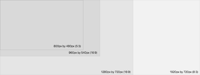
| Dimensions | Aspect ratio |
|---|---|
| 800px × 480px | 5:3 |
| 960px × 540px | 16:9 |
| 1280px × 720px | 16:9 |
| 1920px × 720px | 8:3 |
Provide useful, focused information in a clean layout that’s easy to scan from the driver’s seat. Don’t clutter the screen with nonessential details and unnecessary adornments.
Maintain an overall consistent appearance throughout your app. In general, elements with similar functions should look similar.
Ensure that primary content stands out and feels actionable. Large items catch the eye, appear more important than smaller ones, and are easy to tap. In general, place the most important content and controls in the upper half of the screen.
Use alignment to ease scanning and to communicate organization and hierarchy. Alignment makes an app look neat and organized, helps people focus while scrolling, and makes it easier to find information. Indentation and alignment can also help communicate how groups of content are related.
Provide ample spacing for interactive elements. To ensure that controls are easy to tap while driving, a minimum tappable area of 44pt × 44pt is highly recommended for all controls, even ones that appear smaller than 44pt × 44pt.
Position controls based on driver location. If a vehicle’s built-in touchscreen is positioned to right of the driver, primary interface controls and actions are most easily accessible when placed on the leftmost portion of the screen.
Consider the impact of physical input controls. If a driver must use a rotary knob to control CarPlay, a clear visual hierarchy should communicate how to navigate sequentially and make selections.
Typography
San Francisco (SF) is the CarPlay system typeface. Use SF Pro Text for text 19 points or smaller, and SF Pro Display for text 20 points or larger. When you use San Francisco for text in labels and other interface elements, CarPlay automatically applies the most appropriate variant based on the point size. Download both variants here.

Minimize text. Reading lots of text on a car’s built-in screen is distracting. Seriously consider how much text your app must really display and see what you can communicate with imagery instead.
Emphasize important information. Use font weight, size, and color to highlight the most important information in your app.
Avoid custom fonts. San Francisco is optimized for legibility, which is critically important while driving.
Use built-in text styles whenever possible. The built-in text styles use the system typeface and let you express content in ways that are visually distinct, while retaining optimal legibility.
Use the Body text style for primary content. Use the Subhead and Footnote text styles for labels and secondary content.
Font usage and tracking
When you use San Francisco for text in labels and other interface elements, CarPlay automatically applies the most appropriate tracking (the spacing between letters) value based on the size of the text.
iOS uses San Francisco as the system font for Latin, Greek and Cyrillic alphabets, and a variety of other typefaces for other scripts.
Use the correct variant in interface mockups. Use SF Pro Text for text 19 points or smaller. Use SF Pro Display for text 20 points or larger. Adjust tracking appropriately, according to the following charts:
SF Pro Text
| Size (Points) | Tracking (1/1000em) |
|---|---|
| 11 | +6 |
| 12 | 0 |
| 13 | -6 |
| 14 | -11 |
| 15 | -16 |
| 16 | -20 |
| 17 | -24 |
| 18 | -25 |
SF Pro Display
| Size (Points) | Tracking (1/1000em) |
|---|---|
| 20 | +19 |
| 22 | +16 |
| 28 | +13 |
| 32 | +12 |
| 36 | +11 |
| 50 | +7 |
| 64 | +3 |
| 80 and up | 0 |
Not all apps express tracking values as 1/1000em. Point size based on image resolution of 144ppi for @2x and 216ppi for @3x designs.